To feel ‘at home’ somewhere suggests one feels comfortable in a strange place. To be ‘at home’ with oneself suggests one is not at odds or out of kilter with oneself, not estranged from one’s truth but accepting of it. Compared to its opposite—not to be ‘at home’ suggests one is outside oneself, foreign to oneself. Whether at home or not at home, the idiom carves a strong distinction between oneself on one side and the world outside oneself on the other.
It is hardly a phrase to think twice about. Yet, it is a phrase I found myself thinking when fortunate enough to visit a house by the architect Walter Burley Griffin known as Redstone or, more readily, the Winter House. Constructed between March and December 1935 on a 2.5 acre block of land that had been a plum tree orchard with distant views of Parramatta River, it was the last residence Walter Burley Griffin designed before departing for India in October 1935, where he lived and worked for two years before succumbing to illness in 1937. These many years later finds the residence the most intact by Walter Burley Griffin in New South Wales.
Yet, what has being ‘at home’ to do with it? It is a phrase the nineteenth-century German philosopher Georg Wilhelm FriedrichHegel often uses to punctuate his philosophy. In our striving, he tells us, ‘to obtain satisfaction and freedom in knowing and willing, in learning and actions’, it is the opposite that makes us ‘at home’—when we wall ourselves in behind an ignorance that finds the outside world alien and confronting.((G.W.F. Hegel, Aesthetics: lectures on fine art, Volume 1, translated by T.M. Knox, Clarendon Press, Oxford , 1975, p. 98.))
Yet for Hegel, to truly be ‘at home’ has nothing to do with retreating from what is foreign to be safe within an interior space. To be at home is to be at one with what is foreign, to be free. Freedom, mind you, is not without barriers. Freedom without boundaries is, according to Hegel, ignorance. Freedom is, instead, truth that has barriers a plenty, without which it would be barren. The most immediate barrier is that between oneself and the world outside, where one comes ‘into an opposition with an environment of inorganic nature’. ((Ibid., p. 100.))
Truth, therefore, is not without struggle. The differentiations struggle creates are the walls we find ourselves on either one side or the other. Yet, for Hegel, one’s truth does not reside on one’s side of the wall as most would like to think, but in a reconciliation beyond one’s wall: a point of unity where, as Hegel writes, ‘in this sphere, in this enjoyment of truth, life as feeling is bliss, as thinking is knowledge’. ((Ibid.))
Where, then, does this truth reside in the Winter House?
With internal walls that gracefully curve into the ceiling rather than meet at a perpendicular, there is a sense of deep internal space here; as though one is within the midst of a cave, protected from a harsh outside. This degree of distance between the inside and outside is enhanced by sandstone walls that appear half-a-metre deep when one looks from inside, out the windows.((This is an effect created by U shaped outward jutting recesses on either side of the windows, recesses generally utilised as either storage cupboards or wardrobes.))
Securely secluded, then, from the outside world, behind thickly fortified barriers not unlike those many a nation-state tries to erect to defend against perceived threats from outside, does this not suggest the contrary to Hegel’s notion of freedom? Left at that, as the ordinary house is, one would have to say ‘yes’. Instead, it seems to me, a specific relation between the outside and inside of the Winter House actually makes truth and its accompanying freedom, built-in.
By this I am not referring to Walter Burley Griffin’s Prairie school background. Nor to the fact Walter Burley Griffin used to build directly on the ground, rather than on a level raised above as required by council stipulations. ((As described to us by Ian Stapleton during ‘High Tea’))
Instead, this specific truth-relation begins its play from outside when one looks at the west face of the house. Here, we see a central geometric stone mass evenly flanked on either side by windows where, on the left, the windows are recessed by a patio. Central to this symmetry is a window in the middle, a window (a void) encased by stone.
When we then look at this same wall from the opposite side inside the living room—where, outside, there was a central void (a window) flanked by stone, inside we see the reverse: a central stone mass (housing the fireplace), flanked by voids (windows). The power of the outside symmetry asserts itself in reverse inside; until, that is, truth kicks in.
By carrying the symmetry outside to inside, one simultaneously aligns the centre of both as the same physical point—without thinking. Not until one reads one’s position inside through the opposite outside, does one realise that a void space, a window, on one side of the wall cannot become its opposite, a stone mass, on the other side of the wall. Given the patio that is now, from inside, on the righthand side, the central point of symmetry has shifted. Yet, rather than see this misalignment as an indication that one is out of kilter with the outside world, recognition of it instead calls upon our ability to transcend, through thought, our most immediate of barriers (the wall in front) to see the situation from a point of unity. Only then can we see our true location. To be ‘at home’, then, is to be within this sphere of truth where ‘life as feeling is bliss, as thinking is knowledge …’.((G.W.F. Hegel, Aesthetics: lectures on fine art, Volume 1, translated by T.M. Knox, Clarendon Press, Oxford , 1975, p. 100.))
Whether or not one consciously recognises this relationship between the inside and outside of Walter Burley Griffin’s Winter House, one nevertheless resides within its sphere of bliss.
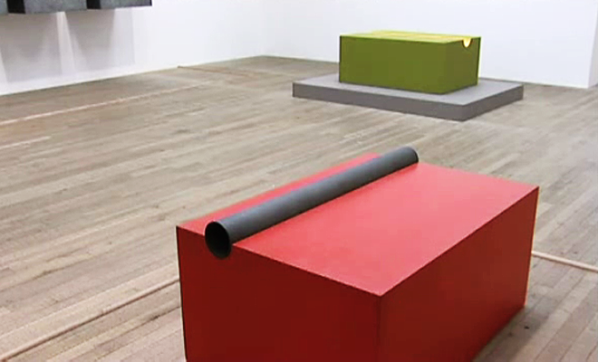
Replica of an original space: yellow green and Replica of an original space: blue light are two wall sculptuations in the group exhibition ‘A Few Pieces’ at Taubert Contemporary in Berlin. Work by artists in the exhibition include: Lars Arrhenius, Geissler & Sann, Gail Hastings, Markus Linnenbrink, Mutter & Genth, Jan van der Ploeg, Markus Weggenmann, Beat Zoderer. The exhibition dates are 17/01/2015 to 07/03/2015. Taubert Contemporary is located at Lindenstraße 35, D – 10969 Berlin.
Gail Hastings travels to Berlin and New York to participate in a group exhibition at Taubert Contemporary and to interview participants for a project supported by an Australia Council Grant.
To make a work of timeless art, 1996, is in the MCA collection exhibition ‘Taking It All Away‘ curated by Natasha Bullock. ‘Diverse in form and character, the works in Taking it all away set the dynamics of space and time against the complexities of modern existence. Together, these works speak to the importance of art history and to the vigorous, evolving nature of contemporary art. The Museum of Contemporary Art Australia dedicates this exhibition to the memory of artists Gordon Bennett and Robert Hunter, who sadly passed away during its development.‘ The exhibition dates are 18/12/2014 to 22/02/2015.
Upcoming exhibition ‘Taking It All Away’ curated by Natasha Bullock at the Museum of Contemporary Art (MCA) will include a work of mine from the collection.
Clarinetist Megan Clune ‘played’ Exhibition: To Do, 2014, on the last day of its exhibition at The Commercial gallery, Sydney. Exhibition: To Do can be played as a musical score given it is, ostensibly, a composition of spacial measures not unlike beats in a bar.
The measured beats in Exhibition: To Do are punctuated by wooden uprights that separate each storage space.
The uprights act much like bars in musical notation that contain within them a group of counts.
Here, though, rather than a time signature such as 3/4 determining a consistent measure throughout, the number of beats is instead determined by the actual measurement of space of each shelf. In this way, each bar separates a physical space played as a musical note.
The pitch of the note is not determined—just its timing.
While this might sound random, it isn’t. The width, breadth and depth of the shelves that comprise Exhibition: To Do are measured in multiples of 18.
For instance, 103 lots of 18 equals the height of Exhibition: To Do at 1854mm; whereas 125 lots of 18 equals its breadth at 2250mm.
Eighteen millimetres is the thickness of plywood used to build the shelves.((See artists’ notes in the art index listing for Exhibition: To Do for more in-depth details on this.))
Accordingly, each wooden upright—or bar—is 18mm and the space between two bars is a multiple of 18. The multiple is, as a result, the count for which one holds the note. If the space between two bars is four lots of 18 (i.e. 4 x 18 = 72mm), then the note is held for four counts while the bar, itself, is held as a pause of one count.
Starting from the left of the West wall, Megan progressively read the count of space between bars, clockwise, then moved on to the next storage unit until the outside and inside of Exhibition: To Do had been entirely played.
Exhibition: To Do, in being a composition of space, is also a ‘To Do’ list compiled to complete an exhibition of art. The last of five items on the list reads: ‘Build racks in which to store the art after the exhibition’.
Any artist preparing for an exhibition would find this last item self-defeating. To include the list item means, in short, one little expects a strong enough response to the work.
The list item suggests preparations to care for the art, no matter its reception. Art may have to undergo a storage shelf’s deep sleep to survive the duration a public takes to wake to it.
In reality, though, artists can ill afford perpetuity’s storage and are unlikely to include it as a preparatory action in the process of making art. To do otherwise can’t help but promote a lack of the art’s reception as a fait accompli.
In Exhibition: To Do, the list item ‘Make the art for an upcoming exhibition’ is not ticked, it remains undone. Exhibition: To Do exists as an awaiting space for art yet to be made; a placeholder for art’s promise—its assurance, its declaration, its belief.
It is the same promise that can overwhelm art students as they forge against preconceptions and shed security to make art. The promise of art drives, it directs; it gets an artist out of bed and into the studio when there is no money with which to eat and pay the rent. It is the same promise against which a student’s resulting artwork is compared and often found to be lacking—where the plans for art hold more potential than their manifested, material reality. Every artist is forever art’s student.
Rather than a tool used with which to make art; in Exhibition: To Do art’s promise is the ‘thing’—the object—exhibited on the shelves.
Usually negated as a nothing of art, it was with extraordinary relief that I heard this promise bellow—its lament, its protest, its resistance, its resolve—when Megan Clune’s clarinet sounded it as a breath-filled, wood-tunnelled number of counts.
When someone a couple of years back asked what sort of art I make, I hesitated. Easy to answer if one makes either painting or sculpture; difficult, if one makes neither. Worse, still, if one makes a spatial art that is not ‘installation’. For which reason I asked, in response, ‘Do you know of installation’? ‘Yes’, she replied. ‘Well—I don’t make that’.
Before I could continue, I was asked if I am Irish. Thinking she had politely changed the subject, I tried as best I could to describe my ancestry. ‘Figures’, she said. ‘It is a bit like asking Paddy:
“Hey Paddy, can you tell me where the nearest pub might be?”
“Ai, my friend, do you know where McCleery Street is?”
“Yes Paddy.”
“Do you know where it intersects McAuley Street?”
“Yes indeed, Paddy.”
“Well, it isn’t there”.’
Point taken. In other words, why point to a positive attribute—a ‘this thing here’—only to say one’s art is not that. Having done so reveals the extent I am desensitised to the non-sense that defines the art I practice; a glitch or necessary blind spot, nevertheless, under which to labour. For invariably, to discuss the art, one has to drive to ‘neither-nor’ places to enable a glimpse of that which contemporary commentary is bereft.
When, in a survey article published in 1965, the artist Donald Judd wrote ‘Half or more of the best new work in the last few years has been neither painting nor sculpture’, ((Donald Judd, ‘Specific Objects’ (1965) in Complete Writings 1959-1975: Gallery Reviews, Book Reviews, Articles, Letters to the Editor, Reports, Statements, Complaints, Halifax, Nova Scotia New York Press of Nova Scotia College of Art and Design, New York University Press 1975, p. 181.)) little could he image that forty-five years later we would still be stuttering his ‘neither-nor’ description, with no advance on a positive identification. Aiding and abetting such stagnancy, it would seem, is a conflation of ‘neither-nor’ with the Proun Space (an ‘interchange station between painting and architecture’) of Russian artist El Lissitzky (1890-1941), to result in an understanding that turns neither-nor into a nowhere land ‘between painting and sculpture’; an understanding that in fact excludes the space upon which both Donald Judd and, one might argue, El Lissitzky focussed.
What is Proun Space? The word ‘Proun’ is an acronym of a Russian phrase comprising three words. The first three letters and the first letter of the remaining two words spell ‘Proun’. ((El Lissitzky, ‘Life, Letters, Text’, ed. Sophie Lissitzky-Küppers, Thames and Hudson, London, 1967, p. 401, fn. 7.)) The phrase, when translated, means ‘Project for affirmation of the new’. Yet, after Herbert Read mentions this in his introduction to El Lissitzky’s letters, he tells us,
‘But there was never anything essentially new in Lissitzky’s style: it was a synthesis of elements taken directly from the ‘suprematism’ and from the ‘constructivism’ of Malevich, Tatlin and other Russian artists’. ((ibid., p. 7. Note, Herbert Read translates Proun as ‘project for the establishment of a new art’.))
Many commentators, since, abide Herbert Read’s discernment and overlook El Lissitzky to go directly to the named sources of the ‘new’ (Malevich, et al.). In so doing, they overlook a type of space that remains without a phoneme of its own in our contemporary art lexicon and thereby remains ‘new’, today.
Not so, however, with Sophie Küppers who, at the time, recognised something very different in the Proun compositions El Lissitzky had been making since 1919. Fascinated upon seeing them the first time at the Exhibition of Russian Art in Berlin in 1922, Sophie obtained El Lissitzky’s address from the Exhibition’s office in hope of exhibiting this ‘new art’ at the gallery she ran, the Kestner-Gesellschaft, in Hanover. ((ibid., p. 11.)) The two met later that year in Hanover, the exhibition took place in 1923 and the two married in January 1925. ((Eric Dluhosch, ‘Translator’s Intorduction’, in ‘El Lissitzky: Russia – An Architecture for World Revolution’, MIT Press, Cambridge, Massachusetts, 1989, p. 15.)) For Sophie Lissitzky-Küppers, El Lissitzky’s Proun compositions were ‘a cosmic space, in which floating geometric forms were held counterpoised by tremendous tensile forces. They were three-dimensional, in contrast to the suprematist compositions of [K]asimir Malevich which gave an effect of absolute flatness and fragmentation’. ((El Lissitzky, ‘Life, Letters, Text’, ed. Sophie Lissitzky-Küppers, Thames and Hudson, London, 1967, p. 11.))
It is largely this difference, recognised by Küppers, that came to the fore in El Lissitzky’s Prounenraum made for the Great Berlin Art Exhibition of 1923, at the Lehrter Bahnhof (1871) where, today, the Berlin Hauptbahnhof (2006) stands. Given a boxlike space at his disposal, El Lissitzky utilised the intended ‘six surfaces’ (four walls, ceiling and floor), except the floor. ((El Lissitzky, ‘Russia – An Architecture for World Revolution’, tr. Eric Dluhosch, MIT Press, Cambridge, Massachusetts, 1989, p. 139)) Black, white and grey geometric elements stacked either flat on the wall, in relief as wooden assemblages, or protruding as perpendicular wooden slats (‘with a flash of red’), organise the space ‘in such a way as to impel everyone automatically to perambulate in it’. ((ibid.))
Where, in the earlier Proun compositions, clusters of geometric forms generated a vanishing point contradicting that of the cluster immediately alongside due to separate axes; in the Prounenraum of 1923, the perambulating person moving through it enacts this multi-perspectival viewpoint within a similarly singular space. From right to left,
‘the surface of the Proun ceases to be a picture and turns into a structure round which we must circle, looking at it from all sides, peering down from above, investigating from below. … Circling around it, we screw ourselves into the space’. ((El Lissitzky, ‘Life, Letters, Text’, ed. Sophie Lissitzky-Küppers, Thames and Hudson, London, 1967, p. 347. It occurs to me that El Lissitzky, quite possibly, had one follow the room from right to left in the manner Hebrew is read, much in the same way gallery spaces in English speaking countries often organise their space from left to right.))
Opposing perspectives seen from above and from below install a movement between extremes realised, here, to make space a ‘plastic form’. ((ibid., p. 347.)) In this way, a Proun space might occur through: a cube (on the left Prounenraum wall) in opposition to a sphere (on the wall preceding it); ((El Lissitzky, ‘Russia – An Architecture for World Revolution’, tr. Eric Dluhosch, MIT Press, Cambridge, Massachusetts, 1989, p. 139)) no perspective in opposition to perspective; two-dimensionality in opposition to three-dimensionality; or painting in opposition to architecture; all within one space—to create that space.
Central to an evaluation by Claire Bishop of El Lissitzky’s Prounenraum with respect to ‘Installation Art’, is its perambulatory nature said to anticipate ‘Merleau-Ponty’s account of embodied vision’. ((Claire Bishop, ‘Installation Art’, Routledge, New York, 2005, p. 80.)) Many regard Phenomenology of Perception (1945) by the philosopher Maurice Merleau-Ponty (1908-61) as key to so-called Minimal art. ((Hal Foster, Rosalind Krauss, Yve-Alain Bois, and Benjamin H. D. Buchloh, ‘Art since 1900’, Thames and Hudson, New York, 2004, p. 494.)) Accordingly, it is perceived Merleau-Ponty, ‘against Descartes’ and any ‘form of idealism’, grounded our being in ‘the partial nature of visual experience due to the “perspectival” limits of human perception’. ((ibid., p. 495.)) The ‘relativism’ of this mono-perspectival ‘embodiment’ is now a general riff that plays through contemporary art history. ((While some may not only disagree with this summation of Maurice Merleau-Ponty’s philosophy but disagree, as well, with whether his philosophy influenced Minimal art, I have taken this understanding from ‘Art since 1900’ given its increasingly prominent use as a resource for a general understanding in contemporary art history.))
Nevertheless, the evaluation by Claire Bishop appears at odds with the fact El Lissitzky’s Proun Space in not mono-perspectival, but multi-perspectival. It is in the act of going beyond the limits of human perception as a singular-point perspective that constructs a multi-perspectival Proun space. In defiance of relativism, it is our conceptual movement beyond ourselves that enables an embodiment in which we ‘screw ourselves in’. In 1966, Joost Baljeu asks, ‘What does a Proun express? Infinite space? Emptiness?’, by way of reply he quotes El Lissitzky:
‘The energetic task which art must accomplish is to transmute the emptiness into space, that is into something which our minds can grasp as an organised unity’. ((Joost Baljeu, ‘The new space in the painting of El Lissitzky’, in El Lissitzky, ‘Life, Letters, Text’, ed. Sophie Lissitzky-Küppers, Thames and Hudson, London, 1967, p. 390.))
While in 1924, in a magazine compiled with Hans Arp called ‘The Isms of Art’, El Lissitzky defines Proun as ‘the station for change from painting to architecture’, in 1925 he writes ‘I cannot define absolutely what “Proun” is’. Sophie Lissitzky, however, refers to a 1928 definition, ‘the interchange station between painting and architecture’, generally quoted since. ((El Lissitzky, ‘Life, Letters, Text’, ed. Sophie Lissitzky-Küppers, Thames and Hudson, London, 1967, p. 21. Sophie Lissitzky-Küppers appears to quote from a ‘personal confession’ entitled ‘Lissitzky Speaks’ (p. 330) and not, as some seem to think, from a statement written to her in a letter.)) Rather than treat this interchange station as a location neither here nor there, a destination not yet reached after a departure some time ago, Joost Baljeu instead interprets it as ‘the station at which art changed trains for architecture’, wherein art became a ‘construction of space’. ((Joost Baljeu, ‘The new space in the painting of El Lissitzky’, in El Lissitzky, ‘Life, Letters, Text’, ed. Sophie Lissitzky-Küppers, Thames and Hudson, London, 1967, p. 392.)) After all, this literally took place at the Lehrter Bahnhof: not a nowhere station ‘in-between’ but at the end of the Lehrte-Berlin line—a definitive location.
In emphasising this, it is not to say a spatial construction excludes either painting or sculpture. Rather, if we focus on ‘spatial construction’ instead of slotting this art ‘between painting and sculpture’, we might finally find the positive terms with which to describe spatial art, rather than let it remain within the silence of an ‘in-between’ land that is ‘neither-nor’.
Image: Gail Hastings, Exhibition: To Do, 2014, acrylic on plywood, plywood, watercolour and lead pencil on paper, 185.4 x 225 x 225cm (photo: Sofia Freeman)
Exhibition: To Do
Closing Launch: Saturday 3 May, 4-6pm
with the work’s spatial score performed by clarinetist
Gail Hastings’ Exhibition: To Do is a ‘to-do list’ for making art not yet done, a task-at-hand still at-hand, except for the construction of storage shelves that await the art, aligned in the gallery along the Earth’s cardinal axes.
Hastings uses the term ‘sculptuation’ to define her practice. This is a term that marries ‘sculpture’ with ‘situation’ so as to shift focus away from the individuated sculptural object and towards the spatial scheme it delineates. […] We dip in and out of the space of the work; interpreting it from afar as distanced observers while simultaneously occupying territory contained within its circumference. Whether consciously or not, we are implicated in the work. We inhabit its topography. Can an e-book be enlisted to perform the same function as these object-based works? Can its screened images — floating inaccessible in the data cloud — coerce the viewer into the same tidal pull as their physical counterparts? […] Why should a virtual book ape the form of a physical book? Surely it can possess its own architecture and pioneer its own pathways. Hastings’ work not only recognizes the possibility of such an architecture, it lays the foundations.
Delicately rendered in watercolour with ruled pencil lines emerging from the edges of the translucent wash, these pieces depict the To Do list in question. One such reminder, the instruction: ‘Build racks in which to store the art after the exhibition’, speaks volumes about the established systems of the art world, and the particular approach artists must take when they create work which sits outside the conventionally commercial.
Cholé Wolifson, 19 April 2014.
Corner caretakers, 2014, one of the four sculptuations in the ebook Missing purchased through iBooks, is also mentioned.
Images 1-4 Gail Hastings, Exhibition: To Do, 2014, acrylic on plywood, plywood, watercolour and lead pencil on paper, 185.5 x 225 x 225cm; image 5 exhibition installation view; images 6-7 Gail Hastings,Corner caretakers, 2014, watercolour and lead pencil on paper in plywood frames, 12 components, each 55 x 46.5 x 1.8cm (Corner caretakers is a sculptuation from Gail Hastings’ eBook, Missing, 2014)
The four walls that make up Gail Hastings’ Exhibition: To Do are oriented within the gallery along the Earth’s axis — coordinates and a rudimentary geometry shared by all. Each wall bears geometric patterns of shelves — small units of space — made of intervals and intersections described and located along x, y and z axes. The pattern of spatial intervals has been determined by the material thickness of the wood used — 18mm; wherein solidity and space play interchanging parts (e.g. solid, space, space, solid, space, space, solid, space, space, solid …) along the height and length of each object. In these ways, Hastings has eliminated extraneous moments of decision-making, lending a sense of givenness to the exhibition but also its need to be made. […]
Space is generally thought of in its ideal form — as empty. Notions, such as needing space to breath, space to move, space to be free and outer space (uninhabited) point this way. In being empty, space is thought of as missing something, something that can fill it. It is why space is spoken of with such potential.
The conundrum, then, is how does one retain this potential when one makes art that creates space — an aesthetic space that is not missing something but is, instead, a something: a concrete thing?
Some time ago I was in a cafe in Melbourne, in St Kilda, enjoying a cup of coffee when I could not help but overhear two conversations on art taking place on either side of me. . .
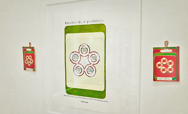
20/200 is group exhibition at Sarah Cottier Gallery that marks 20 years and over 200 exhibitions for the gallery. Gail Hastings is delighted to contribute a sculptuation to the exhibition for having participated in the 1996 exhibition ‘Road to Love’ (20.03.1996–30.03.1996) curated by Mikala Dwyer. The gallery, then, was located at 36 Lennox Street, Newtown, Sydney. The two sculptuations by Gail Hastings included in the 1996 exhibition were untitled 1995 (four pages from the Encyclopaedia of Words), 1995 (private collection, Brisbane) and To make a work of forgetful art, 1996 (private collection, Brisbane). More on 20/200 can be found in the20/200 exhibition record and the Sarah Cottier Gallery website. (photo: habit’s pattern: orange and black, 2010)
With a foreword by art historian Richard Shiff—widely known for his writing on certain Impressionists while lesser known, yet just as profound, for his writing on the art of Donald Judd—Missing‘s52 pages include watercolour moments from the Encyclopaedia of Taking Care in Art, Encyclopaedia of Doubt in Art and Encyclopaedia of Looking for the Plot in Art.
‘Art frame: red’, 2011, by Gail Hastings will be on view in James Roland and Becky Spark’s contribution to Art Month’s Collectors’ Space..
Art Month Presents Collector’s Space
A hidden urban space filled with museum quality artworks never seen together in public before… or ever again.
Curated by Natalia Bradshaw, the Collector’s Space is a unique pop up exhibition which explores personal collecting journeys. Experience highlights from significant and diverse private art collections, free and open to everyone in March. …
The 2014 Collectors:
James Roland and Becky Sparks are a dynamic young couple with a unique collecting vision – they are committed to collecting the art of their contemporaries. Becky and James started actively collecting and supporting contemporary art in 2006. Since that time, they have amassed a significant collection of works, mostly Australian, with a deliberate focus on artists of their generation and younger emerging artists.
At 4pm, 07/02/014 I will be at The Commercial gallery to speak with people as they look at sides: red versus blue, 2009, currently on view in the group exhibition OUI we at The Commercial. GH
From the press release:
Gail Hastings will speak about her exhibited work, the sculptuation ‘sides: red versus blue’and the creation of space. Hastings’ work is both subject and object. It expounds itself. At the same time as being itself, it explains itself. Within this spatial circuit a viewer finds themselves where, perhaps, they least expect to be.
When a fellow artist had occasion to use the keyboard of my computer, they pointed out the letter N was most used and asked why. Unable to answer, two things nevertheless struck me: its overuse was obvious and, although it was obvious, I had not noticed. Alarming enough, there was also this other thing: one would expect overuse of a vowel key, E especially, but N?
A month later, after the trauma of packing up my studio in Sydney and setting up camp in Perth, the answer occurred to me. N is for New. As a Mac user, the keyboard shortcut to open a new page, new window, new anything is ‘Command N’. New, it turns out, is my most overused word — even though I hardly write it.
Overused, too, is New in Australian contemporary art, where the word in its many guises — upcoming artist, fresh artist, young artist — finds PR pundits unable to muster any other distinction to excite an Australian audience.
This will sound dismissive, but I am not. For although all this hankering after the new in art is, well, not new — just as the blinding force of habit left my overuse of N unnoticed — the question is: What is it about the new in art that makes it overused, on the one hand, and so unseen on the other?
By way of answering, it is perhaps of no coincidence that I realised why I overuse the N key when just newly in Perth. Newness is, again, feeling new. This was encapsulated the other day when I purchased the latest issue of Vault magazine from a newsagent on Murray Street in the city, walked down William Street and over the Horseshoe Bridge to a coffee shop in Northbridge on the other side.
What struck me, while doing this, was the dawn-like feeling of walking along a path that held the captivating anticipation of what is new. Yet this feeling took an unexpected turn as I crossed the Horseshoe Bridge. For you see, although I am newly in Perth, I am not new to Perth, I was born here. Crossing the Horseshoe Bridge as a child, where every three of my treadmill steps would equal just one of my parents’, is one of the oldest things I know.
As a child, my heart would sink upon approach of the bridge. Every dint in its curb, every interval in its thickly bevelled balusters, every conversion that passed us by, every bit of dirt historically wedged, every bit of past that built the bridge and by which it stands, still today, exhausted me with information — let alone the sheer effort of willing my legs to keep up.
This time around, though, no dint nor baluster was noticed in what seemed a comparative five strides to cross the bridge — effortlessly. The difference between the effort, then, and the effortless, now, is not dissimilar to the difference between the unfamiliar and familiar, a difference generally accompanied by a sense of struggle.
In this way, struggle defines the new. While the ancients spent a lifetime of struggle to understand one mathematical problem, the same problem today takes a 15 year old just five strides to master. This is the speed of progress. Yet, often accompanying this speed is a mindlessness of the struggle that heralded the progress.
This, though, is necessary. We would become ineffective in our daily lives if we were to recall the genesis of each object we encounter whenever we encountered it. To be effective, the new has to become overlooked: a force of habit. In art, this habituation is the same — and this is the problem. For when we overlook the struggle of art’s new self-determination, we not only overlook the new, but we overlook the art.
This will sound strange coming from someone steeped in a 1960s Minimal art that is, for most, far from new. Yet this art is new, for me, for being so overused while so strikingly overlooked. What, then, in Minimal art is still to dawn? The fact its aesthetic space, the way it is self-determined, is yet to be seen, discussed, acknowledged.
Happy to announce that space holder for a yellow, white and red space will be in the upcoming exhibition at MUMA—Direct Democracy—opening 26/04/2013 https://gailhastings.au/event/direct-democracy/ …
We were squabbling over how best to cut the piece of wood when, with jigsaw in hand, I decided to ignore Mick and get on with the job as I always do — uncomfortable with and annoyed by his audience. Then Mick made a last ditched effort and said, ‘leave the line standing’. Standing? Line?
Mick is the elderly, long time caretaker at St Canice’s parish, Kings Cross. Our conversation took place in the annex where I was working.
I put down the jigsaw, baffled. He explained: ‘You either cut the line off or leave the line standing’. With this I realised there was in fact ‘no line’ between us, we had been saying the same thing just differently, without realising: all that polite frustration with another, for nothing.
When, months later, I came to exhibit my art in the same room, this line seemed the right type of line to leave standing.
For Mick initiated me to a phrase that meant my struggle with ‘the line’ was shared by the legion of carpenters who had coined it. The phrase also spoke of a type of art in which ‘the line’ can often cause an artist considerable dilemma.
We are not speaking, here, of a line one pixel thick as regularly seen on a computer screen, but a line drawn with a lead pencil that is blunt, no matter how often it is sharpened, given the wood grain over which it is drawn. A line one millimetre thick (just sharpened), is a one millimetre difference between a piece of wood fitting within a construction, or not. It is a line that can prove the bane of many a woodworking day.
Generally, we think of a line as the shortest distance between two points. Spatially, it differentiates the area it divides into two. In reality, however, a line — in itself — is also an area. The number of spaces, therefore, a line differentiates is not two (left-side/right-side), but three when we factor in the actual space of the line, a factor that, if ignored, can waste half a day and a good piece of wood.
The space of this line — its medium, its thickness, its history, its lack of transparency, its own problems — is a line mostly ignored, however, when people use it to carve up an issue whether it be in politics or on the home front. Once the issue has been cleaved in two, the line is usually rubbed out along with any trace of fickleness with which it ruled the situation. As a general practice of society, it often becomes a default frame of mind with which we approach many things.
This is made evident in many a student’s first drawing classes that often necessitates a complete mental re-wiring during the first months at art college. One teacher in particular banned the rubber from class, which meant we had to live with the mess of mistakes otherwise called a drawing — a mishmash of inopportune delineations that blighted all recognition of the thing drawn.
These first results couldn’t help but scar one’s sense of achievement until, over time, one became drawn into the force of the lines, themselves, and the lively power of congestion around difficult areas re-drawn, over and again, to get right. Rightness, in the end, no longer mattered compared with a lines’ honest witness to that moment, its independent corroboration and antidote to denial.
My art retains these lines still, today. Whether working on a watercolour or pencilling in the stripes for a painting — I never rub out the lines. When imaginatively walking within a water-colour floor plan, one cannot help but trip over these lines. It is perhaps why it has been suggested I remove the lines that are thought to undermine a sense of the work’s perfection. The lines, however, witness the work.
For this reason it was a delight to hear Mick say ‘leave the line standing’. It was a line in a conversation with a big enough dimension to become the space for an exhibition.
Habit is something we are unable to live without. If the many menial tasks we complete each day were not a matter of habit, they would absorb all the attention we have for other more important things.
Habit allows us to add a couple of spoonfuls of sugar to our tea, without having to register the various tasks necessary to do so. We can be mindless of the way our thumb is variously positioned on the stem of the spoon when it balances the spoon at one moment, tilts it the next, then applies enough pressure to dig into the sugar and secure enough to then tilt the sugar into our cup — all before we stir our tea, let alone sip it. If we were to think through each step as though never before performed, the tea would be cold before it reached our lips.
Habit has benefits.
At what point, though, does habit tip from helping us to achieve more in our day, to blinding us from seeing what, exactly, is in our day?
Habit frees attention by following a perceptual pattern that enables us to do an increasing number of things by blinding us to others. While this is intrinsic to a functioning daily life habit, nevertheless, turns art that activates a paradigm shift — art that invites us to see that which our patterned perceptions inhibit us to see — into art that remains unseen and unrecognised for years.
At this point it might seem odd to cite Minimal art as an example, given it has been around since the 1960s. Yet why is it that those who pour over its imagery in books out of respect for art history, remain blind to recognising for themselves Minimal art’s tenets when experienced in real life?
This would have to be a major mystery confined not only to contemporary art. If the mystery was a floor plan of an enclosed space that we see from above, because it is seen from above, we are able to make correlations between objects inside and outside the space. Our overview enables us to see, for instance, that a blue shape outside the space is the same blue inside the space.
At ground level, however, we are unable to make this correlation since we are without the perceptive power of an overlooking single view. We are either inside the enclosed space or outside — not both at the same time. To compare the two instances of blue, we would have to see the first, remember and compare it to the second: a comparison afflicted by memory’s distortions.
In other words, there is always a spatial shift between an overview of a subject (e.g. as knowledge gained through reading) and a grounded view’s actual experience of that subject.
In habit’s pattern: red and grey, we see a red and grey striped painting that is a ledge. A part of the pattern is missing. The missing part is found in the framed watercolour that rests on the ledge. When seen together, nothing of the pattern is missing, all the parts are accounted for — it is complete. Yet, within this completion, there is a spatial shift. A part of the red and grey striped pattern appears in one space, while the rest appears in another. The two spaces are, however, aligned — through the spatial shift. When we recognise this spatial shift, we forge a connection. Without recognition, the pattern remains disconnected, unrecognised, unseen.
This spatial shift is repeated by the red and grey stripes within the painting we are outside of, while the missing stripes are present in the room within which we stand, as red and grey rugs, when we imaginatively enter the watercolour floor plan. This spatial shift involves a shift in scale. Those locked within the watercolour scenario would fail to correlate the two instances for reasons that constitute the very experience of our everyday. The sculptuation places us, on the other hand, in a position to see.
A ‘Happy New Year’ card is a common greeting sent at this time of year to convey best wishes. This particular card is part of a sculptuation by me exhibited in 2000. It may be 13 years too late, but I return to it to send registered readers with a wish for 2013. The wish concerns not only this card in particular, however, but something about greetings cards and art in general, something encouraging.
For a greetings card’s design has us open it to look at its contents inside. The design thereby differentiates two spaces: an outside image that operates within a public space and an inside content that, in contrast, becomes a private space. With this, a card’s outside is accessible while its inside is inaccessible to all—except the person to whom it is intended.
At odds with this, however, is the way a greetings card is also designed to stand on its own on display. To do so, the secreted inside space cannot remain closed to onlookers, but has to stand slightly open—ajar. This raises the question of whether the inside of a card is a private space in a public sort of way in that we, to whom it is not addressed, are by its very design beckoned to trespass and take a look.
Unlike a card, an everyday object does not have a private space made public. An everyday object may have an internal space with a lid or a door slightly open yet still, by design, it does not instate a differentiation, and thereby a transgression, of space. Unless, that is, the object is an art object.
We see this in the very language with which we discuss art. We discuss the ‘content’ of a work of art when we do not discuss the content of a chair, a spoon, a ladder. The content is the meaning of a work of art as opposed to its image, its surface, its container. This content, as with a card, is generally deemed ‘inaccessible’ except for those to whom it is addressed, which is generally thought to be art’s authorities (the artist, the art historian, the art writer, the curator)—those supposedly in ‘the know’. Art, though, is only ever addressed to art.
This particular card is part of a sculptuation entitled situation no. 41, exhibited at the Art Gallery of NSW in the group exhibition ‘Passing Time’ — the last of the Moët & Chandon Exhibitions.
In situation no. 41, we see the frustration many may feel towards contemporary art made physically and spatially manifest, through the placement of eight greetings cards; each standing ajar on a black topped pedestal, barricaded by a chest-height wall that one has to peer over.
Hampered, this way, from being able to physically reach and open a card to read its content, we are left with the dissatisfaction of an engagement with contemporary art that we feel excludes us.
Although situation no. 41 spans an adjoining wall and floor with objects arranged on both, if one were to lay the sculptuation out flat, one would see that its floor plan forms a one-to-one correlation with the pattern repeated on the cards.
A form from the ‘Bureau of Repetitions’ requires the participation of ‘a curator of contemporary art’ to receive each of the eight cards sent to them through the post and record the time the card is received, on a prepared form (Bureau form). In this way, a curator is ‘tasked’ by a work of art to record it. Unlike the myth perpetrated by some and regrettably enacted by others that insists curators, these days, dictate the terms of a work of art then enacted by an artist, here the curator defers to art. For is it not their vocation to receive, record, repeat, review and enable works of art to be re-lived?
Temporal measurements recorded on the form became stripes painted within a room that doubles as one of the shapes on the card.
Striped paintings are a particular breed of Abstract art that flourished in the century just passed. The repetition of striped paintings is not, however, the only type of repetition referred to in the watercolour conversation of situation no. 41.
To a certain extent one can say that any work of contemporary art is a repetition of past art. In situation no. 41, we see this in the way the eight differently coloured cards act as art elements received and ‘recorded’ by an art authority — an art record then reckoned with by an artists and turned into coloured stripes.
Although the repetition, here, between one art instance (posted cards) and another (painted stripes) occurs with little resemblance between the two (except for a correlation of colour), this type of connection between art of the past and present is what stokes the coals of art history.
On one side, it is called ‘appropriation’. Once common in Australia as a celebrated practice, our distance from international art centres that limits a direct engagement, fuels appropriation. For artists gain access to this art through art history and art periodicals; an influence that generally tags the resulting art, whether wittingly or unwittingly.
On the other side the direct engagement of art by artists who make their own record (response, reception) and, from which, a repetition of sorts is derived no matter the lack of admittance by the artist or lack of resemblance.
Either way, art makes art. There is no other way to make it. When art does not deny this, we find its truth beyond its repetition as art that is original.
The watercolour conversation in situation no. 41 reiterates the repetition of art by art when it refers to the pattern on the blue card as being a repeat of a ‘famous fabric pattern … seen in a museum, somewhere’. This automatically places the work of art’s influence, content, meaning—all that is within a card—somewhere inaccessible to us here, now, looking at this present work of art (seen in a museum, somewhere).
In effect, two spaces are delineated: an inaccessible space within which the meaning of the work of art is located that we are outside of, and the more public space of the work of art—its image—that we do have access to and, in situation no. 41, find ourselves inside of.
For most, the conversation ends here as it does in the watercolours. The resulting tone, therefore, of the watercolour conversation is critically dismissive. It cannot see beyond its own fear, dread, prejudice. It cannot see beyond itself.
Yet this is the opportunity situation no. 41 offers, an opportunity to overcome this disconnectedness from art through the empowerment of realising one is in fact standing at the very centre of its meaning.
For the ‘famous fabric pattern’ source of the work of art’s repetition is, in fact, the framed fabric pattern one passes upon entering situation no. 41; which makes the inaccessible museum somewhere else the museum one is, in fact, standing in the middle of.
Since the fabric pattern hangs on the sculptuation’s boundary, the very process of passing it to enter the delineated space makes it a memory. It is as memory, then—not a private but public and accessible memory—that the present work of art’s repetition is generated. The power of recognising this is the power that awaits anyone who dares to trespass and correlate the space one feels locked out of with the space one is actually walking around in, when one engages with a sculptuation.
And so this is my wish for art readers in 2013: that you will find much joy in the thrill, the liberation, the freedom and the power that comes when one is prepared to take ‘that’ look at art and thereby step beyond a self-imposed limit into the centre of meaning—the centre within which one already stands—with the reply ‘Of course, didn’t you’.
On Monday 3 September 2012, ABC art: red cube (2008) was taken off the exhibition wall of Less is More at Heide Museum of Modern Art before the exhibition’s conclusion, upon my request. This was a drastic and, for me, painful action made necessary given there was no retraction of the curator’s views expressed in the exhibition’s catalogue and, hence, no alternative even though, to this day, I respect the curator very much.
Here, I directly address the misrepresentation of ABC art: red cube.
The section of the curator’s text that frames my art’s inclusion is in Part III, ‘Notes on Contemporary Post-Minimalism’, and entitled ‘The viewer’ — which reads:
It was Robert Morris, more than any other minimalist, who brought the viewer and their field of vision to the fore in his articles about Minimal art. The spectator, more strongly aware than before of being in the same space as the art object, apprehends it ‘from various positions and under varying conditions of light and spatial context’. The object is ‘but one of the terms in the newer aesthetic’, he wrote [in Notes on Sculpture, 1966].
… A shift in emphasis from the art object to its perception by a viewing subject is a key turning point between the modern and postmodern. Artists from subsequent generations, Peter Tyndall and Gail Hastings have in different ways taken this shift to the heart of their practice both focusing on the situational aspects of apprehending art. [p. 67, Less is More catalogue]
… If Tyndall’s work in the 1970s was shaped by the analytical approach of conceptual art, then Hastings, who emerged in the 1990s, is part of a younger generation who look back on Minimal and Conceptual art with a fresh perspective. For example, Mel Bochner’s Measurement Series from 1967 (a work illustrated in Pincus-Witten’s book Postminimalism) was formative for Hastings. In a self-reflexive gesture, Bochner mapped the measurements of the exhibition space onto the gallery walls using numbers and arrows, creating a diagram of the room commensurate with the actual room. Hastings enjoyed his conflation of real and pictorial space, but where Bochner used feet and inches, she instead preferred ‘more improbable units such as thoughts, conversations and inconsequences’. [p. 69, Less is More catalogue]
The artwork by me referred to hereis Floor plan: Empty, except (1990). It was first exhibited at what is now called Gertrude Contemporary, Melbourne, in 1990 and re-exhibited in the first Primavera exhibition at the Museum of Contemporary Art, Sydney, in 1992.
Floor plan: Empty, except bookmarked, in particular, New York artist Mel Bochner’s Measurement: Room at Galerie Heiner Friedrich, Munich, where Mel Bochner graphed the measurements of a pre-existing gallery space onto that same gallery space in feet and inches, using letraset and black tape. By bookmarking this piece, Floor plan: Empty, except returned to it at a point in time in Melbourne when it was far from anyone’s mind.
In returning to it, Floor plan: Empty, except did not graph the measurements of a pre-existing space onto that space as did the Measurement: Room but, instead, graphed the measurements of a ‘created’ space onto that same created space.
The created space of Floor plan: Empty, except was between opposites: a square and a circle; a Room of Remembered Mistakes and a Room of Mistakes About to be; the past, the future; the physical entry and exit of a passageway. Uppermost, though, the space was created between the opposites of a two-dimensional picture within which one imaginatively roams (a floorplan), and a three-dimensional geometric rendition of that same picture within which one physically roams (note, this and other works of this nature by me precede Kathy Temin’s three-dimensional rendition of a Frank Stella painting).
This tension between the 2- and 3-dimensions is not to be glossed over as it typifies, for example, my time at the Victorian College of the Arts (VCA), Melbourne, as an undergraduate student in sculpture wherein I encountered minimalism. The sculpture department was, at that time, a non-entity. Not only was it detached from the main art college by being across the road, but traffic between it and the rest of the art college was one way. While we would routinely wander the corridors of our painting, printmaking and photography counterparts, the interest was not returned.
In Melbourne at the time, ‘art’ was synonymous with ‘painting’. The Dean of the art college was a painter. Although the New York art market had already crashed by the time I began at the VCA — the trickle down effect had just reached Melbourne. Painting, therefore, was still the name of the game. If you were a sculpture student, this fact was borne as one massive chip on our collective shoulder.
From within this darkness, then, of the disregarded — where I floundered in what would eventually be my study’s non-productiveness — I first encountered minimalism during an art history lecture. Minimalism made the real space of sculpture matter. Minimalism integrated real space with the thoughtful space of art. Minimalism made space active. I was captivated.
It was as a part of these lectures on minimalism that I first learned of Mel Bochner’s Measurement: Room. Its role, in the story we were told, was duplicitous. On the one hand, it clearly illustrated how minimalism turned the illusory 2-dimensional space of a painting into the ‘real’ 3-dimensional space of a room. We see this in the manner by which the Measurement: Room graphs the ‘x’ and ‘y ‘coordinates of a grid — as per Albrecht Dürer’s renaissance tool, a wooden window inlaid with a wire grid through which he graphed the model on the other side onto his drawing — onto the real space of a room.
The point here, reiterated by my art history lecturer numerously and in different ways, was that sculpture became relevant through minimalism not because of sculpture and its history, but because of its opposite and its history — painting. This, as a sculpture student, was very hard to take.
It is, however, what we see in the black hole of Lee Bontecou’s reliefs of the late 1950s that had Donald Judd write in 1965, ‘The black hole does not allude to a black hole; it is one’.
Here, a black hole bridges the opposition between itself as a 2-dimensional space in a painting, and itself as a 3-dimensional space that is real, the same 3-dimensional space within which we stand to look at it.
As a bridge between opposites, I understood this black hole as intersubjective even though I did not entirely know what that meant until later, after much learning (still incomplete). Intersubjectivity is the opposite of relativism. It is the reciprocal recognition between oneself and the other (the opposite) upon which our ability to reason is hinged. Its one-to-one concurrence of thought and actual space in minimalism was compelling. This intersubjectivity was not between an artist and a viewer, but between a viewer and that same viewer in opposite positions in relation to a work of art.
Mel Bochner’s Measurement: Room took place within this black hole that bridged 2- and 3-dimensional space. That, though, is on the one hand. On the other hand, in doing so, the Measurement: Room stepped away from this black hole into a critique of modernity’s systematic standardisation of space manifested through the pragmatics of measurement.
Against the Measurement: Room, then — in criticism of it — Floor plan: Empty, except about faced to step back towards what I perceived as the unfinished business of minimalism. It did so by turning the Measurement: Room‘s empirical measurement of feet and inches (12 inches make one foot, three feet make 1 yard) into measurements whereby thought and space concur: 12 inconsequences make 1 thought, three thoughts make one conversation. Much to my dismay, no one seemed to recognise this difference given no one seemed to recognise the Measurement: Room. This was formative.
In this way Floor plan: Empty, except graphed the measurements of a created space onto that same created space. This is not the ‘phenomenological space’ associated with Robert Morris, but the space of intersubjectivity’s black hole. Yet the curator’s text for Less is More frames my art within terms of Robert Morris’ phenomenological space.
It may at first be difficult to appreciate the difference between this phenomenological space and the space of intersubjectivity’s black hole when both seem to point to the same thing. One could even look at Lee Bontecou’s reliefs and describe them in terms from Notes on Sculpture as having taken ‘relationships out of the work‘ — where the relationships, here, form the space of a black hole within the relief — to make them ‘a function of space, light, and the viewer’s field of vision’ — where the space within the relief is made a function of the space within which we stand to look at it.
Similarities aside, the differences matter. Namely, Notes on Sculpture makes clear that the new art (minimalism) stems from sculpture, alone, without any history of painting. Whether right or wrong, ABC art: red cube did not stem from this understanding but its opposite, as made clear by its inclusion of 2-dimensional elements that, framed by Notes on Sculpture, are rendered invalid.
Furthermore, Notes on Sculpture denounces a relief’s engagement of real space since, amongst other things, a relief relies on the same wall support as painting and is, therefore, locked into the ‘x’ (down, up) and ‘y’ (left, right) coordinates of painting, unable to partake in the third dimension. ABC art: red cube hangs on the wall and thereby, through inference, is grievously impugned as lacking engagement with real space.
To have framed my art’s inclusion in the exhibition through reference to Robert Morris’ phenomenological space is to have seriously and severely misrepresented ABC art: red cube. An informed understanding of this framing cannot help but see ABC art: red cube as incompetent on all counts.
Moreover, by framing my art this way, the curator short circuits the space of intersubjectivity’s black hole, given its historical scaffolding is eliminated in preference of phenomenological space.
On its own, ABC art: red cube is quick to make friends, so why withdraw it from Less is More when, most likely, few have or will read the catalogue?
Even if only one person reads the catalogue, ABC art: red cube is misrepresented. When the next person decides to focus on minimalism in Australia in any way, it is this catalogue they will read. Without indication ABC art: red cube has been misrepresented and without financial support for research assistance, which is most likely, they will take what is written on board even though they realise catalogue texts are the views of the writer and not necessarily of the artist. Artist’s don’t necessarily get it right, either. Nevertheless, misrepresentations so very easily become entrenched as art history. ABC art: red cube has much more to give than that.
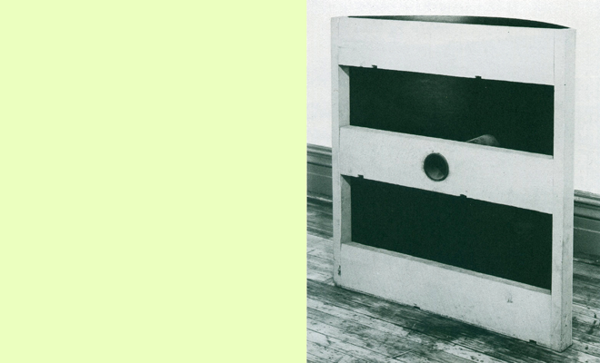
Note 1:
In each of the six units that comprise this piece, we find a division of its space into two: an open lit space and a closed un-lit space. Each of these two spaces is the opposite of the other: open as opposed to closed, lit as opposed to unlit. By opposing the other, each defines the other.
We see the open, lit space first. It is lined by five planes of wood: two sides, top, bottom and back. This is the space we most likely first look into when we look at the work. The sixth plane, a vertical plane between us and the depth of the box, is open to us and the space within which we stand to look at the work.
Note 2:
The closed, unlit space is behind the open lit space, between it and the supporting wall at the back. It is lined by six closed planes. This space is black for lack of light — a void. Not only, though, for this reason is it a black hole — a nothing rather than a something. It is also a black hole in our perception of the piece, for many may not even see this black unlit space as existing — a nothing rather than a something.
This is so, even though Donald Judd does not hide the thickness of the ply, nor does he hide the fact the depth of the first lit space does not go all the way to the back wall. These two facts are obvious. Yet the third fact that these two add up to, remains a black hole.
Note 3:
In between the units along the wall, we see a third space defined by the wooden units. Its depth is the combined depth of the two opposing spaces noted above. The five spaces in between the units are as much a boxed space as the two found within the units.
These space boxes, however, are comprised of three closed planes — two wooden sides and the gallery wall behind — and three open planes — the top, front and bottom. The wooden boxes are seen as closed spaces in comparison with this their opposite, the open spatial boxes between them.
Note 4:
The fourth space delineated by the six wooden units is the space within which we stand to look at them. It interfaces with the one open plane of the six closed wooden boxes, and the three open planes of the five open space boxes.
This fourth space is as much a black hole as the space at the back of the wooden boxes.
The two black holes, however, oppose each other in that one is without light when the other is full of light, the light that enables us to see. Yet each is a much a black hole as the other, in that we see neither.
While browsing iTunes one fine July 2007 day, I happened upon a new release by Austin Indie band ‘Spoon’ with a cover image of the artist Lee Bontecou by photographer Ugo Mulas, taken in 1963.
Instantly impressed, I eagerly investigated further and came across an interview. Here, singer/guitarist Britt Daniel explains that, although he was not aware of the sculptor before coming across the image, the image immediately struck him as typifying the mood he felt about the record. ‘It’s just this guy, Bontecou, looking at all these pieces of debris’ says the interviewer, to which the singer replies, ‘Yeah, and they’re weird pieces. Or colorful. They just are’.
While I suggest the singer had his band’s songs more in view than Lee Bontecou’s art by his reply (as Lee Bontecou’s art, of that time, was pretty much dark and light with a lot of dirty looking tones between), what is nevertheless startling is that, rather than inform the interviewer Lee Bontecou is female, the singer instead revealed he, too, thought Lee Bontecou is male; for which reason, it now becomes obvious, he felt an affinity.
The mistake would have been mortifying for the singer once discovered, which it was, as made evident by another interview some weeks later. Had he realised earlier, the impetus behind the cover’s selection would not have been there and another image would have appeared in its place. So I am glad of the mistake, as it has produced one of the most arresting album covers I have seen in a long time.
Although these mistakes are everyday and unworthy of being held ransom to, this one is nevertheless uncanny since it bespeaks a silent tragedy that has throttled a vital understanding of contemporary art from around the time the photo was taken up until today. For what this mistake reveals—given the singer most likely comes from a progressive background—is that even under such an enlightened perspective, an innate prejudice still persists in society to the extent certain postures are read as male, only. The blowtorch, a back turned rather than a front offered, independence of mind, an absorption in one’s work, a disdain for conformity, taking one’s time and our gaze directed in a non-objectifying way spell male artist, not female. If this is now, no wonder Lee Bontecou’s art was treated as threatening in New York’s decidedly male dominated art scene of the late 1950s—back then.
For these reasons, Lee Bontecou’s art could have easily been dismissed by the minimalist artist Donald Judd who was on the job, at the time, as an art writer as a means to fund his then relatively unknown studio practice. If the catalogue essay for the present exhibition Less is More is right in its description—where, ‘for him, less (or non) of some things—symbol, narrative, illusion, incident—meant more of an emphasis on others—like dimensionality, shape, ‘material as material’ and an engagement with real space’—then Donald Judd’s dismissal of Lee Bontecou’s art should have been par for the course. But, it wasn’t.
Instead, Donald Judd recognised in Lee Bontecou’s art a paradigm shift. Even the term most associated with Donald Judd—‘specific objects’—was first formulated, as the art historian Richard Shiff points out, in 1963 when describing a Lee Bontecou relief as ‘actual and specific and … experienced as an object’. (GH, The process of specific space, 2009.)
According to the New York Times art critic Roberta Smith, Specific Objects is one of the three most significant contemporary art essays to this day (ref). The other two are Clement Greenberg’s Modernist Painting (1960-1) and Michael Fried’s Art and Objecthood (1967). It was written in 1964 when Donald Judd was assigned to write a survey article of the present art situation, yet was not published until the end of 1965. Its opening sentence is now iconic: ‘Half or more of the best new work is the last few years has been neither painting nor sculpture’. (ref.) Written afterwards, though published months before, is another text by Donald Judd that opens: ‘Lee Bontecou was one of the first to use a three-dimensional form that was neither painting nor sculpture’. (ref.)
In these works by Lee Bontecou of that time (see Slide 4 above), we see an eruptive force explode a gridded picture plane into the actual space of the room. ‘Bontecou’s constructions stand out from the wall like contoured volcanoes. Their craters are voids but exceedingly aggressive ones, thrust starkly at the onlooker; these are threateningly concrete holes to be among’, wrote Donald Judd in 1960. The resulting radiation of concentric circles intrude upon the usually segregated space of a viewer, with a black gaping hole at the centre.
‘The black hole does not allude to a black hole; it is one’, wrote Donald Judd in 1965. Posited, then, at the centre of a pictorial space was a black hole of real space. In being real, the usual segregation between the pictorial space of a work of art and the real space of a room in which we look at that work of art, had been violated. As a result, the artwork’s black hole moves between opposing poles as a space that includes us (real space) and a space that excludes us (pictorial space).
Upon observing this dialectical action of space, Donald Judd took it back to his studio as a tool that helped redefine his art into the art we recognise as his, today. He later describes it as created space. It is an active space opposite to the space we have come to know through the writing of Robert Morris, which is a passive space—such as the given space of a room. The difference between the two may be difficult to comprehend, especially as Donald Judd is broadly known as laying heavy emphasis on the ‘given’ — on ‘material fact’— which would lead one to think the space of his art is the same room space as Robert Morris’, but it is not. Real space, for Donald Judd is not found as is the space of a room, but created.
To understand this difference we have to remember Donald Judd majored in philosophy at Columbia University. Much in philosophy focuses on the question of truth, such as: how do we know the representation of an object in our thoughts corresponds with the actual object outside our thoughts. In other words: how do we know we are not just imagining it? Post-modernism’s reply is that we cannot know, since everything is relative: what I see from my perspective will be different to what you see from your perspective.
If we are locked into our own perspective, then it is easy to be held captive by our own prejudice. We see an example of this in America’s political far right, who insist President Obama has no legitimacy to be President since he was not born in America; a belief they hold onto even though the White House has released the President’s birth certificate (the fact of the matter) that proves otherwise. Relativity, therefore, knows no bounds; facts don’t figure.
You can see why Donald Judd would not have championed post-modernism and its accompanying relativism, given he was on the side of facts. What this means is that, rather than start from a position of self-certainty, barricaded in by one’s own perspective, one instead starts from a space of uncertainty, moves beyond it, takes up the space of the other (facts), from which one then returns with knowledge of the other. As Richard Shiff has said, ‘Judd was more of a viewer than most viewers are … [he] recognised the danger of starting his position as definitive’ (ref). Instead of a perspective without bounds, facts—the other—holds it in check. In philosophy it is known as intersubjectivity. It is the opposite of relativism.
When Donald Judd observed a dialectical act of space in Lee Bontecou’s art, he recognised in it the dialectical act of intersubjectivity. Thought, then, that creates this dialectical act of space does not take place in the private space of oneself, but the public space outside oneself: the space of the other, of ‘facts’ — the artwork.
As I have written earlier:
Robert Storr, when recently writing on Lee Bontecou who ‘dropped out of the art world at the height of her fame in the mid-1970s’, points out that, ‘Writing someone back into art history thus entails risks both for the writer and the artist’. Critically unmeasured advocacy, or ‘sins of commission’, can cause more damage than past writers’ ‘sins of omission’.
Without refrain, nevertheless, Robert Storr little flinches when pointing out one drastic omission in particular, that of Lee Bontecou’s work by Rosalind Krauss in Passages of Modern Sculpture (1977); a book that ‘established the canon for many curators and critics with power in or over major institutions’. Drastic, in that, to ‘be left out of the book meant oblivion in many academic circles where histories are constructed’.
Mentioned are just five women sculptors: Louise Bourgeois, Barbara Hepworth, Eva Hesse, Louise Nevelson and Beverley Pepper. ‘None except Hepworth and Pepper rate more than a line or two and a text figure’.
With this he points out, ‘Robert Morris, the sculptor-critic of the 1960s to whom Krauss’s work is heavily indebted, did not discuss Bontecou in his Continuous Project Altered Daily’; added to which, ‘Krauss’s other mentor Clement Greenberg did so once, only in passing and disparagingly at that’ (ref).
In a footnote Robert Storr adds:
I have emphasized Judd’s role in critical literature on Bontecou in part because his ability to recognize and eagerness to champion her work are key to understanding his position. Judd’s … tough-minded thinking … never takes the fatal step into prescriptive or proscriptive dogma commonly taken by other formalists of the period. Like Lippard, Judd was a writer of strict standards, and was open to arguments that diverged from the perspectives he primarily adopted. Although opinionated, he was an aesthetic empiricist and a pluralist. Moreover he was alert to artists work outside the mainstream, and seemingly at odds with the classicism of his own approach, as if these artists spoke for the eccentric or grotesque parts of his own sensibility that he had subordinated to his formally severe methods and means. (ref)
In accrediting Donald Judd for championing Lee Bontecou’s art, we also see Robert Storr flounder a bit in trying to understanding why he did so, to end up suggesting Lee Bontecou’s art may have spoken for a subordinated part of his own, when nothing of the sort is the case. Yet, to suggest this indicates Robert Storr is not familiar with the type of space of Donald Judd’s art, nor the role of Lee Bontecou’s art in its genesis. This is not surprising for the reasons he himself has revealed, in which we see the effect of an invisible misogyny determining an art historical account even in modern times.
This is also apparent in James Meyer’s books on minimalism in which the space of Donald Judd’s art always comes off as a poor man’s Robert Morris, since Robert Morris’ is the only understanding of space the writer acknowledges. Within its context Donald Judd’s art is judged both badly and mistakenly.
The Less is More catalogue follows this pattern and, by doing so, reenacts an inherited misogyny. As a result, Donald Judd’s main concern is left out: created space.
Minus its proper nomenclature (‘created space’) and minus recognition of its genesis, this is the space to which I was introduced as minimalism when an art student in the late eighties at the VCA, Melbourne. Sitting in the dark of a slide show, with an art history teacher decrying again and again ‘but don’t you see’ while projecting an image of a Donald Judd piece (see Slide 5 above), I have to admit at first I didn’t. No matter the times he described the work in terms not unlike those I’ve used to describe Donald Judd’s observations of Lee Bontecou’s art, and no matter how beseeching his ‘but don’t you sees’ became—I just didn’t. All I could see was a grainy black and white photo of a number of fabricated metal boxes lined up in a row, industrial looking, hard, uninviting, purposively made yet seemingly pointless—with another row mounted on the wall behind. None of this seemed ‘new’ nor exciting, let alone anything to do with ‘space’. Once you’ve seen a metal box you’ve seen a metal box, what more is there to see?
A little shocked by my negativity, I finally decided to notice something I had been staring at but avoiding to see because it seemed so pointless: a black hole opening at the end of a rectangular tube inset horizontally along the top front edges of the boxes, joining them. In finally seeing this comparatively small black hole, it drew my imagination beyond the prejudice that had previously held me back. My thoughts now zoomed along the narrow tunnel’s darkness, aware of the blackness’ constricted space, length, openness and frictionless speed. Then suddenly, I was jettisoned into its opposite: the internal comparatively vast blackness of the first metal box that was closed, contained, motionless and in which I felt stuck.
Shocked, my eyes focused on the box’s metal exterior that now gained a hitherto unthought-of thinness that gave me surprising comfort, in an effort to hoist my thoughts out of the box’s dark insides and back into the light. Safe again, my focus gravitated to the shadowed gap between the first and second boxes that took on a robust thickness compared with the metal thinness sandwiching it on two sides. With this, I finally understood my art history teacher’s exhortations to see our conscious thoughts taking place in this space outside us, rather than in the dark of our physical self (he was, admittedly, German and no doubt brought up on the philosophy that allowed him to draw our attention to this).
Then the slide projector revved into motion as the next slide lunged into view, when I had only begun to see the previous one. How did Donald Judd orchestrate all this space intact with intricate differences that seemingly exploded from nowhere? How was it possible not at first to see what was now so abundantly present, when before all I could see was a row of metal boxes? And how were my thoughts taking place out there, amidst all that, rather than locked away in the privacy of me?
From that day on I have been dedicated to minimalism. While I admit I have, at times, been lazy in my observations and have sometimes been swayed by criticisms before recognising their fallacies, I have never lost sight of how minimalism makes fundamental experience a self-consciousness of our freedom.
The piece by Donald Judd described above, Untitled 1966, was exhibited in the exhibition Primary Structures at the Jewish Museum, New York, in April 1996. In the catalogue for the exhibition, Donald Judd writes:
‘I object to several popular ideas. I don’t think anyone’s work is reductive. The most the term can mean is that new work doesn’t have what the old work had. … New work is just as complex and developed as old work. … Prior work could be called reductive too; … compared to the new work it would even mean less, since then much of its own meaning would be irrelevant’. (ref)
The point here is that every period of art throughout history is ‘reductive’ since it includes less of the period preceding it, to make way for what is new. Use of the term to differentiate one period from another is therefore redundant. Moreover, as one can see by the description of space above, this art involves extraordinary complexity, not reduction. As long as one continues to call it ‘reductive’ one continues to negate its complexity and thereby negate what is truly new.
To move beyond a ‘reductive’ understanding of minimalism, I suggest you start with Donald Judd’s piece included in Less is More. First, free yourself of the limitations with which you might at first perceive it (it’s just a well crafted metal box, open on two ends with coloured perspex inside that sits on the floor and around which I can walk), by finding what you keep staring at but, because of these limitations, keep refusing to see. Then hold on to your hat as you get drawn into an architectonics of space at the very moment of being made, where ‘physics and fantasy are indivisible within an impossible spatial möbius’.(ref)
In the end, you might also find yourself thankful Donald Judd did not dismiss the importance of Lee Bontecou’s art when most did. Thankfully, there is an increasing number of art historians who seek facts over hearsay and who have, as a result, rescued the created space of Donald Judd’s art from the oblivion of misogyny’s tragic graveyard. Foremost, of course, is Richard Shiff, as well as David Raskin, including curators who worked with Donald Judd, Marianne Stockebrand.
As an appropriate ending, then, it is worth having a listen to one of Spoon’s more popular tracks on this 2007 album with Lee Bontecou in her studio on its cover. For uncannily, although the selection of this image was the result of mistaken identity, the track suggests no mistake was made at all but, rather, as the song goes … ‘the call of a lifetime ring’ … (Britt Daniel, The Underdog).
NB: Most of what is said here is based on premises established in an extensive manner in: Gail Hastings, The process of specific space: Minimal art generally, Donald Judd’s art particularly, The University of Sydney, 2009.
When we read a review of a book or movie, we expect the reviewer to have read the entire book or to have seen the whole movie before passing judgment. If, instead, they pass judgment having seen only a fragment and, consequently, not knowing how that fragment plays out within the whole, then it is reasonable to disregard their judgment as ill founded.
Yet we nevertheless subscribe to newspapers and magazines that present reviews of the ‘best’ movies, books and art exhibitions — a comparative judgment based on a complete overview — when, similarly, this cannot be the case given the sheer magnitude of material any one reviewer is faced with, today.
There was, however, a time when this was possible. This, though, in literature at least, was over by the end of the eighteenth century due to an explosive expansion of production.
In Germany, alone, publications dramatically increased to 1,000 by the end of the eighteenth century, to multiply by 800% forty years later. This sheer velocity of production blew apart any attempt of a comprehensive review.
Having witnessed this exponential combustion, the German literary critic and philosopher Friedrich Schlegel (1772-1829), turned to irony in his 1797 Kristische Fragmente to address what he described ‘the impossibility and necessity of a complete communication’. As Frederick Beiser explains:
The ironist feels that complete communication is impossible because any perspective is partial, any concept is limited, and any statement perfectible; the truth is intrinsically inexhaustible, defying any single perspective, concept, or statement of it. But he also sees that complete communication is necessary because it is only by postulating the ideal of the whole, which guides and organizes our otherwise blind and scattered efforts, that we approach the truth.
Symptomatic of modernity’s social alienation presaged by a rapid advancement of the industrial revolution, we see the ‘whole’, here, recognised as necessary, but forever lost. In its shadow, as a state impossible to reach, meaning is posited not in that which remains — art as fragment — but in that which is missing. Art is where it is not. The whole is mourned as an unattainable ideal.
This, however, is not the ‘whole’ of Hegel, nor the ‘whole’ of Donald Judd. For both the whole is not an ideal in the manner of a Platonic Form that is pure and immaterial. No. Instead, the whole is actual, attainable and ‘real’.
This, though, is not to say the ‘whole’ of a work of art is its empirical height, width and breadth. This, I would say, is the passive whole of a work of art, not its active whole, not that which makes it actual.
Nor is the ‘whole’ of a three-dimensional spatial work of art determined by the room within which it is seen (as is installation art). It is, instead, self-dertemining. It is determined by the manner through which it brings itself about as a whole. In this way, the whole for Donald Judd as a work of art, ‘asserts its own existence, form and power. It becomes an object in its own right’.
For Hegel, the actual whole is not the empirical dimensions or the resulting object where the ‘bare result is the corpse which has left the guiding tendency behind it’, ‘but rather the result together with the process through which it came about’.
Whatever is not a part of this process is not a part of what makes a spatial work of art whole.
With this we might better understand what Donald Judd means by ‘quality’ when he says ‘The thing as a whole, its quality as a whole, is what is interesting’. It is this quality that is noteworthy of a work of art.
The term ‘aesthetics’ was first ascribed the burgeoning discipline in 1735 when the German student of philosophy Alexander Gottlieb Baumgarten coined it in his master’s thesis to mean ‘epistêmê aisthetikê, the science of what is sensed and imagined’. ((Paul Guyer, “18th Century German Aesthetic”, The Stanford Encyclopedia of Philosophy (Fall 2008).)) The first book published under its name was by the same philosopher, entitled Aesthetica (1750).
The term nevertheless underwent considerable refinement so that by the time GWF Hegel gave his lectures on Aesthetics at the Berlin University in 1823, 1826 and 1828-9, ((T. M. Knox, “Translator’s Preface,” in Hegel’s Aesthetics: Lectures on Fine Art (Oxford: Oxford University Press, 1975), vi.)) he could clarify its ‘proper expression’ as the ‘Philosophy of Art’. ((Georg Wilhelm Friedrich Hegel, Aesthetics: Lectures on Fine Art, trans. T. M. Knox, 2 vols., vol. 1 (Oxford: Clarendon Press, 1975), p. 1.))
Integral to Hegel’s aesthetics is the intersubjectivity of conceptual thought as recongised by Immanuel Kant.
While this may be so, well aware as we are of the limits of embodied knowledge, knowledge shaped by our singular perspective on life, how is it possible to go beyond the singularity of our perspective to gain an intersubjective or aperspectival view of art, of life, while our knowledge remains embodied?
We find an answer and an example in the very fact we are conscious of the singular ‘perspectivity of our knowledge’ — its subjectivity, its limitations. For as Paul Redding asks, ‘do we not understand that condition from a point of view free of the perspectivity?’. ((Paul Redding, Continental Idealism: Leibniz to Nietzsche, Routledge, London, 2009, p. 58.))
Conceptual thought — intrinsically connected to sense experience (embodied knowledge), not disconnected (disembodied knowledge) — enables intersubjectivity. As is often quoted of Kant, ‘thoughts without content are empty, intuitions without concepts are blind’ (A51/B75) — where ‘content’ and ‘intuitions’ are sense experience. ((Immanuel Kant, Critique of Pure Reason, tr. Paul Guyer & Allen w. Wood, Cambridge University Press, New York, 1998, p. 193.)) Through intersubjectivity, the wholeness of a work of art can be perceived.
Wholeness is not, therefore, a dirty word. As Donald Judd writes in his survey essay of contemporary art entitled ‘Specific Objects’ published in 1965, ‘The thing as a whole, its quality as a whole, is what is interesting’. ((Donald Judd, “Specific Objects,” in Complete Writings 1959-1975, New York University Press 1975, p. 187.))
Few, however, are aware Donald Judd said this. For it qualifies something written six sentences earlier in the same paragraph—‘A work needs only to be interesting’ — a sentence condemned at the time and erroneously echoed in academic papers, even now, minus the qualification. Nevertheless what is interesting is the ‘thing as a whole, its quality as a whole’.
It is much for this reason, it would seem, Donald Judd said aesthetics had been irrelevant ‘until now’.
Yet as Donald Judd intimates, the notion of unity intrinsic to a perception of space in art reaches right back to Plato and Aristotle. As Paul Redding writes, ‘Platonism can be contrasted with Aristotelianism in as much as it identifies “unity” rather than “being” as the central concept from which all reasoning begins. “Platonism is … a “henology” (from the Greek to hen, the one) as opposed to an Aristotelian “ontology”’. ((Paul Redding reiterates a point made by Dieter Henrich; Ibid, p. 57.))
Thankfully, given the ancient depths of henology, the only thing one needs in order to engage with the wholeness of a work of art is one’s wits about oneself while in the moment.
Everyone agrees that ultimately one essential of art is unity. After that the agreement breaks down. This fact of unity doesn’t seem to say much, which is an ancient characteristic of aesthetics, the most uncertain and least developed branch of philosophy and the most ignored by those it concerns, including myself until now. Barnett Newman told Susanne Langer that aesthetics is for the artist as ornithology is for the birds. It’s now a famous quip. ((Donald Judd, “Art and Architecture,” in Complete Writings 1975-1986 (Eindhoven: Van Abbemuseum, 1987), 27.)) Donald Judd (1928-1994)
Aesthetics, admittedly, belongs to the past. As we can see, its relevance to visual artists came to rest well before the 1960s. Dead and buried, it is perhaps no wonder art history departments in universities tend no longer to incorporate its hardened yards within lectures. Yet any practitioner who recognises the integral role unity plays in making ‘space’, has eventually to delve aesthetic’s bottomless depths to understand how.
This, though, is to work against the times. Any notion of ‘wholeness’ in art has from prior World War One onwards been well and truly blown apart to leave us in a world of fragmentary perspectives that conflict and contradict in our relativist times. This, though, not only typifies the shattered perspectives of a cubist picture plane. It also typifies our engagement with it.
At some point we seem to have accepted singular perspective as a limit of our embodied knowledge. Unable to escape this limit, we are unable to reach an aperspectival (intersubjective or objective) point of view. For we tend generally to link aperspectivity with the disembodied knowledge of a ‘God’s-eye view’.
Any consideration of ‘unity’ in art today after minimalism has, therefore, to consider it on two fronts: that of a work of art and that of our engagement with it. For in minimalism the space of a work of art is no longer quarantined from the space of a viewer’s engagement (by a pedestal, for instance), but takes place in the space of a viewer’s engagement.
This, though, leads to an often-rehearsed criticism of minimalism. Although minimalism recognises the space of a viewer’s engagement, it does not recognise the particularity of that engagement, a particularity at odds with its ‘wholeness’. A particularity, more to the point, that defeats any unity taking place within it.
Admittedly, minimalism has been left in a daze by this criticism. Yet only because important work by the German philosopher Immanuel Kant (1724-1804) has been missing from the debate. Not his third critique, mind you, the Critique of the Power of Judgment (1790) generally referred to in art texts, but his first critique, the Critique of Pure Reason (1781 and 1787). For it is Immanuel Kant who links aperspectivity, Paul Redding tell us in Continental Idealism: Leibniz to Nietzsche, not with a disembodied ‘God’s-eye view’, but with the ‘achievement’ our embodied perspective has gained through the mundanely terrestrial activity of ‘conceptual thought’. ((Paul Redding, Continental Idealism: Leibniz to Nietzsche (London and New York: Routledge, 2009), 58.))
While Immanuel Kant, himself, compares the import of his critique with the Copernican heliocentric revolution, it is a revolution in thought yet to dawn on what it means for a work of art to take place within a viewer’s engagement. When it does, aesthetics may once again be a part of art history lectures and the role of a viewer’s intersubjectivity in enabling the unity of a work of art, a new and much needed part of those lectures.
For one reason or another I have had to put words to paper in preparation of my next exhibition. They namely concern the title of the exhibition: [space holder]. It is a title that aspires to benefit a discussion on space as an art object that is fraught, from the outset, for a few reasons.
The minimalist Donald Judd, for whom space is made by thought, named two: space is invisible and without history.
The first is obvious enough. If visual art is not visible, how can we discuss it, how can we – in terms of Facebook and its increasing grip on status — ‘Like’ it? This inability is symptomatic of a hurdle hard to clear. The second, a lack of history, is a hurdle already jumped. Donald Judd’s art, since 1962, marks the beginning of this history; albeit a history generally ignored – especially in Australia.
The third reason is more difficult. Space, as an art object, is an oxymoron. An early lesson in drawing, for instance, involves differentiation between positive space (an object – solid and material) and negative space (the space surrounding an object – non-solid and non-material). A space-object makes nonsense of this distinction. How, then, can we makesense of art as a space-object?
This is where the title ‘space holder’ helps.
Upon hearing it, a scenario of being in queue somewhere is hopefully not far from mind. Especially when, say, in a supermarket queue we realise we have forgotten something we need to fetch and turn to the person behind to ask if they wouldn’t mind holding our space in line.
In this simple act a social contract is made between oneself and a stranger who vows to hold one’s claim. The held space is a whole space complete with limits not defined by walls, but by another’s recognition that it is ours.
In this way the space is corroborated (by a stranger), is intersubjective (an arrangement between two people), and is social (not a figment of one’s imagination in the form of a private thought space, but actual in the form of a public social space). This is the space of a sculptuation.
Yet how does the space in queue transpire as a space-object in art? Based on corroboration, such a space differentiates itself from being immaterial (a nothing) to being material (a something). A ‘thing’ of shared understanding is objective, not subjective. In being objective, verifiable and whole, solidity is engendered – unlike space per se. Space, therefore, has somehow to be activated to become solid like an object. But, again, how?
When we turn to a stranger in a queue, we are in fact turning to ourselves in this other position. For if we are not prepared to hold this same claim for a stranger in a reverse scenario, we cannot ask it for ourselves.
The viewer of a sculptuation similarly traverses opposing positions. By doing so, they activate that space to make it an art object. This is not how space is activated in Donald Judd’s art, but it is how it is activated in mine. The space in both, however, empowers through a basis in recognition. ((As the philosopher Hegel tells us, ‘Pure self-recognition in absolute otherness, this Aether as such, is the ground and soil of Science or knowledge in general. The beginning of philosophy presupposes or requires that consciousness should dwell in this element. But this element itself achieves its own perfection and transparency only through the movement of its becoming. It is pure spirituality as the universal that has the form of simple immediacy.’: G.W.F. Hegel, Phenomenology of Spirit, trans. A.V. Miller, Clarendon Press, Oxford, 1977, p. 14))
If nevertheless this sounds dubious and I sound an impetuous upstart insisting upon a new understanding designed to serve my interests only and best ignored — then ask yourself this. Next time you are in a supermarket, there is a long queue of which you are near the front and you realise you have forgotten one vital thing you need to fetch, will you stand your ground and insist this new understanding in art is unwarranted, or will you turn to the stranger behind and ask if they wouldn’t mind holding your space in line?
Jack the cat belonged to a fellow resident in my block of flats. While still little, Jack would follow his owner to the bottom floor laundry where, one day, Jack spotted me. A few days later I heard a tiny meow at my door – it was Jack. He came to say hello. Other residents said the same. It was a delight to be visited by Jack.
After a couple of weeks, though, Jack’s conversation changed. He would meow, walk in, turn around and wait for the door to be closed. He expected to be cuddled. Allergic to cats, I resisted. He stared and waited. Ashamed, I stared back; unable to explain why. The stand-off finally passed. In a way, he seemed pleased.
My flat is basically an art storage room stacked with objects and their shadows. Jack would crouch at a shadow’s edge and wait to pounce on whatever darted from its darkness. He also discovered my window that looks onto the garden, his paradise.
This new routine lasted a couple of weeks. Then the next meow I heard was not from outside my door, but my window. At first it was during the day, then at night — all through it. Roused from sleep by Jack’s terrifying screeches of despair, my flat became his thoroughfare. It was a nightmare to be visited by Jack.
Nevertheless I figured poor Jack was being locked out. So I opened the laundry door late at night and left a note that asked for it to be left open. This worked fine at first – until someone took objection, closed the door and removed the note just about every time. A war of attrition ensued for weeks between the note-watchman and me, and me and Jack.
Since obligations as citizens afford us rights as individuals, most important of these is abidance of the law. While the law, at large, was not brought into question here, the so-called law of my block of flats was — and I was running up against it. When is it right to do wrong?
The question tapped into ramifications far broader than Jack’s situation. Although a law-abiding citizen, I have nevertheless been breaking the law in art just about my entire adult life.
‘There is no right or wrong in art’, you might say. Well, so the storybooks tell us. That, though, tends to be an illusion supported by a fantasy that artists are self-indulgent non-conformist bohemian brats — a picture painted as justification by those who deem it equally self-indulgent to assist art financially at a governmental level.
The right and wrong in art concerns originality. This, though, is not without paradox, since originality in contemporary art takes on certain parameters within which any shift too great breaks the context that defines it. ((Something I previously wrote in ‘Why I make editions‘.)) If one breaks the context, the tools with which to recognise art as art are broken too. Unable to be recognised as art, originality suffers illegitimacy. It is locked out, not unlike Jack.
Any artist who dares to let it in suffers the consequences of devoting themselves to an activity that, in being illegitimate, is neither recognised nor supported by the establishment (their art is not included in glossy art magazines nor discussed favourably in The Australian or Sydney Morning Herald newspapers). They have, therefore, to carry the social burden of its originality — the social isolation and resulting poverty. ((Oddly in Australia, it seems, those who act on another’s originality and thereby treat it as fact, as established, benefit from it, are even recognised for it, while the originator doesn’t benefit nor is recognised.)) Why, then, let originality in if it is such a nightmare?
As odd as it might seem, this is the question I faced every time I was denied the comfort of sleep by the harrowing pleas of Jack, when I would then let him in. More odd still is the answer I discovered in doing so. For no matter the hardship caused by Jack’s pleas, it would be wrong to blame Jack for this hardship by not letting him in. To blame Jack would be to blame the darkness of night for every burglary that took place at that hour. Jack was innocent. So too is originality in art, no matter the hardship it causes.
Art is not made anew by originality. Art remains the same. Yet habits in seeing have us lose sight of art every now and again; we forget what it is. Originality reminds us. Originality lets us find ourselves in art once more, by taking us down a different path to meet it.
It is not entirely fair to say Jack treated my flat at night as a thoroughfare. After the fist week, once let in, he would dive for one of my feet, curl up on it as though to weigh it down and prevent me from reaching the door to let him out. This photo was taken just after one of these occasions, at something like two or three in the morning.
After some weeks this new routine sadly ended, too. Jack met with an accident on the road outside, crawled into the garden’s darkness one last time and closed his eyes on paradise.
In truth, I am not sure for how much longer I could have lasted his final routine. My productivity decreased markedly. I will, nevertheless, always be thankful I met Jack the little kitten cat.
A ‘limited edition’ is a term we generally associate with printmaking or photography in contemporary art. Both involve the reproduction of an artwork a number of times. If the ‘number of times’ is limited to, say, 100 prints, then the artwork is an edition of 100.
There is a problem here, however, with the word ‘reproduction’. For the word suggests it is an original artwork that is copied. The ‘original’, however, from which a contemporary print is pulled is not, in fact, an artwork but a block of wood, piece of lino or etched metal plate. While in photography, if digital, it is a raw image file of electronic signals turned into 0’s and 1’s.
Technically speaking, then, each print is not a ‘copy’ of an artwork, but an artwork in itself. As ‘originality’ is one of the most persisting measures of a work of art, the question therefore arises as to how a contemporary print can be original and a reproduction at the same time.
If originality rests on difference, we can find difference within printmaking by the fact a source degenerates, through wear and tear, each time a print is taken. As a result, each print is particular in its departure from the ‘whole’. If, however, its departure is too original, the print loses its value as part of a whole. Originality, as such, takes on certain parameters within which any shift too great breaks the context that defines it.
The relation between the whole and its parts, the prints, is therefore interesting. In certain ways it is not unlike the relation between the ancient philosopher Plato’s pure forms — ideas — and the objects derived from them. A pure form, for instance, could be a bed. If we think of all the beds built throughout time, each and every bed is but a reproduction of the one true bed, the absolute bed, the idea of a bed.
Yet this idea of a bed is not something we can actually pull back the covers of and sleep in. Its reproductions, however, as the concrete objects that populate our bedrooms, are.
Similarly, although the abiding image of a contemporary print edition is reproduced by each print, it — as an object itself — does not exist.
Accordingly, there cannot be two (or more) ideas of a bed, only one ideal bed from which others are derived. An original cannot be a copy at the same time. For ‘if there had been two’, writes Plato in The Republic, ‘there would always have been a third — more absolute and abstract than either, under which they would have been included’. The third, therefore, would be the original and the other two its copies.
This, though, flies in the face of a contemporary print being an original as well as a copy. There is nevertheless still a similarity. An Ideal form is a whole that includes its reproductions, just as a print edition’s abiding image, the conglomerate of all that is common in each print, is a whole that includes each print’s similarities.
This parallel between Plato’s pure forms and a limited edition is, however, an awkward one to make today. Any Platonic notion of a pure Idea or absolute Ideal has been permanently besmirched for any artist working on this side of minimalism.
A non-material form we cannot physically experience (the idea of a bed) is no longer more ‘real’, as in Plato’s day, than a material object we can physically experience (a concrete bed). The real is no longer God given (Plato’s forms), but earth bound (minimalism’s objects). Experience no longer confounds understanding (Plato) but is its foundation (minimalism). Minimalism is the ‘art of the real’. ((The art of the real; USA, 1948-1968 was the title of the 1968 exhibition curated by E.C. Goossen that included works by the minimalists and which travelled to Europe.))
Post modernism, of course, took anti-Platonism further to obliterate the ‘pure’ entirely. In this way ‘particularity’, in all its cultural, social, sexual and technological difference, is here to stay. Difference is defiance. Under such sway, the ‘whole’ is secularised blasphemy.
This, for me at least, is a problem. I consider the ‘whole’ — albeit generally unrecognised — integral to minimalism, and I love minimalism. With everyone busy burning the ‘pure’ to much applause, no one appears to realise they have used the ‘whole’ as kindle. No art history lecture or essay have identified this. It has been a problem without words for me, for so long. Until, that is, I began to make editions.
The first edition I made was during a six-month Power Institute studio residency at the Cité Internationale des Arts, Paris, in 1995. Not that I thought of or called the art I subsequently made an edition at the time. It was, rather, a nameless urge inspired by a purchase I made from the lower floor hardware section of the Bazar de l’Hôtel de Ville department store.
The Bazar de l’Hôtel de Ville, as some will recall, is where in 1914 Marcel Duchamp purchased the first ‘unassisted’ readymade – the Bottle Rack (1914). ((See Thierry de Duve, ‘Kant after Duchamp’, An October Book, The MIT Press, p. 250.))
Now treated with the conservator’s white gloves of art history as one of its most precious contemporary art objects, at the time this first unassisted readymade was unceremoniously dumped in the rubbish by Marcel Duchamp’s sister when tasked with clearing his studio after his departure for New York. Not until 1921 was a replacement purchased. ((See the National Gallery of Australia‘s notes. ))
With this we have another parallel with a Platonic pure form. While many replicas have since ensured this first unassisted readymade retains its place in history, we only know this bottle rack through its replicas since it, itself, like a pure form, does not materially exist. ((Based on notes from the National Gallery of Australia‘s website, in 1921 Marcel Duchamp purchased a replacement (collection: Robert Lebel, Paris); in 1945 Man Ray purchased a third replica; in 1960 Robert Rauschenberg purchased a fourth replica in New York; and in 1963 a fifth was made for the Moderna Museet, Stockholm. In addition to which, in 1964, an edition of eight was made by Galleria Schwarz, Milan — of which the National Gallery of Australia has one. See picture.))
It was not this, admittedly, that had me repeatedly traipse up Rue de Rivoli to ransack the basement floor of the Bazar de l’Hôtel de Ville to see, embarrassing as it is to admit, if they might perchance still sell the same bottle rack. They do not. Yet, in seeking it, I was captivated by how Duchamp’s 1914 bottle rack was but one of an unintentional limited edition. Each bottle rack was a reproduction of an Ideal bottle rack, the bottle rack each customer thought they had purchased before they discovered the idiosyncrasies, the faults, the particularities, of the one they actually purchased. Having signed an idiosyncratically ridden bottle rack, Marcel Duchamp effectively replaced the ‘Ideal’ in art that is pure and original, with a ‘particular’ that is impure and banal. He replaced the ‘whole’ with a ‘part’.
If only I could make the same retrospectively inspired, though at the time ‘disinterested’, purchase. I tried, but failed.
No matter on how many days I searched the basement, I had finally to realise I was no Marcel Duchamp (how arrogant, I know, to have even presumed otherwise). I accepted failure, then found something. Not a readymade, but a vacuum pack of brass circles arrayed in a geometric flower pattern, on a hot magenta and lime green board.
Each pack of five rings reproduces the same pattern, differently. Each represents a possibility within a certain set of circumstances that delimit a whole space. I bought quite a few packs, took them back to the Power studio at the Cité and made the same work over and over — enamoured by a ‘whole’ from which each possibility derived.
I took these with me to Düsseldorf, as I was about to have an exhibition there. The gallery director — Thomas Taubert — suggested we sell them as a limited edition. ((Encyclopaedia of possibilities, 1995, a limited edition of three, each of three parts, was exhibited in To make a work of thoughtful art, Ausstellungsraum Thomas Taubert, Düsseldorf, in 1995.)) I have made numerous editions since.
Mistakenly, some say Anthony Caro was the first to make pedestal-less three-dimensional art. ((Many will be fortunate to remember having seen Anthony Caro’s abstract sculpture in Sculpture by the Seaat Bondi Beach, Sydney, in October 2010.)) As for who did what first, when it comes to boycotting the pedestal (or plinth, as we are more likely to call it in Australia), although dates might seem to measure the matter, other factors intervene to render them misleading.
At face value, the difference between a pedestal-less sculpture that sits directly on the floor (Anthony Caro’s) and a pedestal-less three-dimensional work of art that sits directly on the floor (Donald Judd’s) might seem difficult to find, even in the semantics. Especially as this difference cannot be measured by any phenomenological involvement of a viewer. By ‘phenomenological’ I mean where one’s physical or ‘kinaesthetic’ relation to the work or art is not excluded form it — by a frame, for instance — but included.
For although most attribute a viewer’s phenomenological awakening in art to American Minimalism of the mid 1960’s, it was in fact through his discussion of Anthony Caro’s sculpture made from 1960 and exhibited at the Whitechapel Gallery in London in 1963, that the art historian Michael Fried was first to include one’s locomotive relation as an aspect of the art (see slide 2). Here, as Michael Fried tells us, ‘the three-dimensionality of sculpture corresponds to the phenomenological framework in which we exist, move, perceive, experience, and communicate with others’. ((Michael Fried, ‘Art and Objecthood: Essays and Reviews’, University of Chicago Press, Chicago and London, 1998, p. 274.))
It is nonetheless within this ‘correspondence’ that we find a difference between the pedestal-less art of Anthony Caro and Donald Judd. While both engage the ‘coordinate’ of a third-dimension that ‘art has to share with non-art’, as the American art critic Clement Greenberg was wont to describe it, ((Clement Greenberg, ‘Recentness of Sculpture’, in ‘Minimal Art: A Critical Anthology’, ed. Gregory Battcock, University of California Press, New York, 1968, p. 183.)) the abstracted imagery of Anthony Caro’s sculpture separates it from non-art to make it visible as art.
More heightened now than before, we can see this imagery in Anthony Caro’s main piece exhibited in Sculpture by the Sea, which reportedly centres ‘on an anchor that forms a nose and mouth’. Donald Judd’s three-dimensional pieces, on the other hand, struggle with invisibility for lacking imagery.
In lacking imagery, Clement Greenberg tells us, ‘Minimal works are readable as art, as almost anything is today — including a door, a table, or a blank sheet of paper’. ((ibid.)) This is to say there is no intrinsic difference between a work of Minimal art and a utilitarian object alongside it, except we call the first art. The figurative correlations within Anthony Caro’s sculpture, on the other hand, segregate it from the space of the everyday by raising it off the floor and into a symbolic representational space — whether placed directly on the floor, pedestal-less, or not.
It is, however, only by lacking representational space that Donald Judd’s pedestal-less art open an entirely different and new aesthetic space that Anthony Caro’s, for instance, cannot.
It is the creation of this aesthetic space, it seems to me, that is the true revolution in 1960’s art. Its creation differentiates Donald Judd’s art from the space we walk through, while made from the space we walk through. ((see Roberta Smith, ‘Donald Judd’, in ‘Donald Judd : A Catalogue of the Exhibition at the National Gallery of Canada, Ottawa, 24 May-6 July, 1975’, ed. Brydon Smith, National Gallery of Canada, Ottawa, 1975, p. 30.)) It leaves behind the art of illusion to introduce, instead, the art of noticing.
Within these terms, then, one is right to say Donald Judd was first to make pedestal-less three-dimensional art; an art threatened by invisibility for being so.
This raises the question: What happens to this new aesthetic space when a museum places a piece by Donald Judd on a pedestal? The answer: the pedestal destroys it. Not until the incident at the Tate Modern nearly ten years ago, however, could we have seen how.
In Untitled 1964 (RSS46 – see slide 1), what we see is space made solid. This will sound odd, since the very definition of space is the opposite of solid — as something non-solid. Nevertheless, the movement between opposites in Donald Judd’s art materialises space; it makes space a something rather than a nothing. As Donald Judd has written:
[W]hat is needed is a created space, space made by someone, space that is formed as is a solid, the two the same, with the space and the solid defining each other. ((Donald Judd, ‘On Russian Art and Its Relation to My Work’, in ‘Complete Writings 1975-1986’, Van Abbemuseum, Eindhoven, 1987, p.17.))
Untitled 1964 (RSS46) is a solid rectilinear volume with a non-solid semicircular trough running on top and to one side. Without the pedestal (see slide 3), it creates a spatial opposite, in reverse, above. As if by reflex, the non-solid semicircular trough becomes solid (see slide 4). This is not an illusion, but reason’s spontaneous movement harnessed by Donald Judd to materialise space.
By placing Untitled 1964 (RSS46) on a pedestal, the spatial volume above disappears, as does the length of semicircular solid space that it defines. In its place, a surrounding space cloaks the artwork’s volume on all four sides, as defined by the pedestal (see slide 5). Albeit a space, it is not a space created by Donald Judd. It is not a space made solid through reason’s movement. It is a space to be looked through, not at.
Seemingly frustrated by our inability to see the space he created, in a text printed posthumously Donald Judd wrote:
There has been almost no discussion of space in art, nor in the present. The most important and developed aspect of present art is unknown. This concern, my main concern, has no history. There is no context; there are no terms; there are not any theories. There is only the visible work invisible. ((Donald Judd, ‘Some aspects of color in general and red and black in particular’, Artforum International. vol 32 n10 (Summer 1994). p. 70.))
While much has changed due, in large, to writing by art historian Richard Shiff that concentrates on Donald Judd’s ‘space’, and while the passage by Donald Judd quoted above is reprinted in the Tate’s exhibition catalogue, it goes to show that still, today, this passage has not been quoted enough.
(This is the final of a three part text, first published 13/06/2011.)
The image above is Caravaggio’s Conversion on the Way to Damascus, c.1600-01, commissioned for the Cerasi Chapel, Santa Maria del Popolo church, Rome. Fallen from his horse, sword strewn useless by his side, we see a prostrate Saul of Tarsus startled by a brilliant light through which, he later tells us, he heard Jesus ask ‘Saul, Saul, why do you persecute me?’.
Saul, until that moment, had made it his business to seek and slay anyone in Jerusalem who had joined the small but growing band of followers that believed in Jesus after his death. Since Saul believed no Messiah would belittle himself to suffer the humiliating indignity of crucifixion, then Jesus was not the Messiah his followers proclaimed. His view, though, was turned upside down while on the road to Damascus by a blinding light that, as the story goes, enabled him to see. Saul became Apostle Paul and spread the word of Jesus. His writings form a large part of the New Testament.
I mention all this to raise the question: is Alain de Botton’s latest book ‘Religion for Atheists’ published in January this year, his conversion-on-the-road-to-Damascus moment? Has Alain de Botton similarly fallen from the so-called persecutory high horse of an atheist non-believer, to now see the light in religion?
The book’s title is quick with a reply. Rather than advance a negative relation between religion and atheists through the usual phrase ‘atheists against religion’, an opposition between the two is maintained albeit turned on its head to advance, instead, a positive relation that makes religion for atheists. This Alain de Botton calls ‘Atheism 2.0’, an upgrade defined by the positive, not the negative.
Any atheist watching the video of his Ted talk of July last year, would be hard pushed not to feel inspired by the potential of this ‘upgrade’. For although reason may be paramount to one’s understanding of the world, when it comes to one’s relations with others, reason tends often to go astray.
This is our particular modern day tragedy. Reason triumphs in science, in medicine, in engineering, in internet technology. Yet, when it comes to its very genesis through our relations with others — without which we would not be able to reason — it fails, dismally.
We see this every time a government performs atrocities on its own people. The road Damascus in Syria, today, is disfigured by the Syrian assault on it own people protesting since January 2011 where, according to witnesses, ‘soldiers who refused to open fire on civilians were summarily executed by the Syrian Army’. ((Opeyemi Olowonyoyin, ‘al-Assad vs Syrians’, read more here)) Saul’s road to Damascus is still bathed in bloodshed, not fraternity, when the technology that built the road and developed the tools for bloodshed, are a marvel of reason.
For many, an answer to this tragedy is religion: a Godless society is a loveless, brutal existence. This, though, pits love against reason only to cut love off at its very roots: reason (where the reciprocal relationship of love between a parent and child is the movement of reason).
This is where Atheism 2.0 walks in. A brutal society is not due to reason, but to reason not exercised well enough. By harnessing the tools of religion that enrich its understanding, Atheism 2.0 hopes to enrich, instead, the social cohesion and fraternal fruitfulness we atheists entrust in reason.
In this way, the notion of Atheism 2.0 is inspiring. At least so I thought until I discovered the role art would play.
Art, in being one of the tools the Catholic Church has wielded so successfully, would play a similar role in Atheism 2.0. It is a role that shuttles art back to the Council of Trent in the early 17th century. It is a role that makes Atheism 2.0 inconsistent, I find, with atheism.
The Council of Trent (1545–1563) was the Catholic Church’s response to the threat posed by the Protestant Reformation. In Trent, the Catholic Church convened and formed the Counter Reformation that set the tone of the Church’s reinvigoration over the next three-hundred years. Integral, was a renewal of its culture in which art played an essential role. Through art, the story of Christ was to be told in a manner so convincing that one could not help but be drawn in. Along with it, the ideals of the Church would also be imparted. Commissioning guidelines drawn up by the council subsequently bankrolled what we now know as the Italian Baroque.
In Caravaggio’s Conversion on the Way to Damascus, we see the Council’s guidelines in full force. Strident tonal contrasts tell the story of Saul’s conversion from the dark of having persecuted believers to the light of becoming a believer, himself. With arms outstretched in embrace of ‘Christ’s light’, the extreme foreshortening of the figure has us tumble into this embrace as we similarly topple from our high horse of indifference outside the painting, into the open arms of belief within it.
While this type of ‘absorption’ in art is an attribute ascribed by the art historian Michael Fried to later works, he nevertheless writes that ‘subjects involving absorptive states and activities are present in abundance in earlier painting, and that in the work of some of the greatest seventeenth-century masters in particular — Caravaggio, Domenichino (in the Last Communion of St. Jerome), Poussin, Le Sueur, Georges de La Tour, Velázquez, Zurbarán, Vermeer, and, supremely, Rembrandt come at once to mind — those states and activities are rendered with an intensity and a persuasiveness never subsequently surpassed’. ((Michael Fried, ‘The Primacy of Absorption’ in Absorption and Theatricality, The University of Chicago Press, Chicago, 1980, p. 43))
Some, however, feel there is a flaw in Caravaggio’s painting. The crush of foot space below the horse’s hooves, suggests faulty foreshortening. This, it seems to me, is but the effect of absorption. Having toppled into the painting, we find ourselves unconsciously scrambling for somewhere to stand other than on top of Saul. The resulting discomfort is, instead, indicative of the painting’s persuasive power, rather than a flaw. So persuasive, in fact, that once a beholder of the time had been drawn in, they would have been unable to draw back.
I say a beholder of the time since we, in our modern world, cannot help but see the painting differently. Back then, though, there was only one direction in an engagement with this art: absorption without release. For although a beholder in 1601 would have, after some time, eventually made their way to the door of Santa Maria del Popolo church and onward home, they in fact would nonetheless have never left the world view of the painting—a world view prescribed by the Church.
For us, now, in our modern life, this would be akin to walking past a church one hot Sydney Saturday afternoon to spy a beckoning depth of cool shade through its open doors. The welcoming sound of a choir rehearsing inside helps to entice one in. Then, after some time relieved inside from the harshness outside, upon turning to walk back out one finds one cannot leave, as the doors have disappeared. Instead, in art today, one is no longer locked in, but able to step away. The movement of engagement is reciprocal.
In being reciprocal, engagement involves two directions, not just the one that leads us in. For ‘We have got beyond venerating works of art as divine and worshipping them’ writes the philosopher Hegel. ((GWF Hegel, Hegel’s Aesthetics: Lectures on fine Art’, trans. T.M. Knox, Oxford University Press, Oxford, vol.1, 1975, p. 9)) Not because we have decided it is not the done thing anymore, that it is not fashionable, but because the necessities of thought, of reason, have changed.
So changed, in fact, that in 1787 the philosopher Immanuel Kant compares this change to the Copernicus Revolution. ((Imanuel Kant, ‘Critique of Pure Reason’, ed. Paul Guyer, Cambrodge University Press, New York, 1998, p. 110)) Having once thought we, on Earth, were at the centre of the galaxy around which the sun rotates, we discover Earth is but one of a number of planets that rotates, instead, around the sun. The shift in how we now understand thought is that big.
Accordingly for the post-Kantian Hegel, as Robert Pippin tells us, ‘traditional, image-based art is no longer as important a vehicle of meaning for us now, given how we have come to understand ourselves, have come to understand understanding’. ((Robert B. Pippin, ‘The Persistence of Subjectivity: On the Kantian Aftermath’, Cambridge University Press, New York, 2005, p. 280))
Engagement in art, today, is through reason’s reciprocal movement between positions, not belief’s pre-ordained certainty. Its movement is from subject to object, with a return movement from object to subject. The movement is intersubjective; not a movement between a person and an object such as a chair we sit on, but between one person and another. This would have to be the oddest thing about art. For although art is an object, we treat it in the same way we treat a fellow person. This has nothing to do with any figurative rendition within the work of art or not. In fact this relation is, I would argue, more profound when the work of art is non-referential and does not stand in or speak for the artist in any way. Intersubjectivity, here, is not between a viewer and the artist via the work of art, but between a viewer and an object we seek meaning from, just as we seek meaning from the person we are in a conversation with, when we do not seek meaning from the chair we sit on.
To return art to the days of Trent is to return art to a singular position of belief, rather than engage with it through the opposing positions of reason that is part of modern society.
Nevertheless, Alain de Botton finds engaging with contemporary art difficult, as if he is barred at contemporary art’s very entrance, unable to get in. ((Alain de Botton, transcribed from the video, ‘…that’s why a very common feeling when you are in a museum is, let’s admit it, ‘I don’t know what this is about’. If we are serious people we don’t admit to that, but that feeling of puzzlement is structural to contemporary art.’ )) This, though, is not the fault of contemporary art but, rather, a fault in how well we exercise our ‘engagement’.
From what I see, the degree of how well we engage with each other (as a society) is reflected in how well we engage with contemporary art. Improve one, we improve the other.
For which reason I predict, if Alain de Botton is able to upgrade atheism without subjugating art to a pre-Copernicus-understanding of thought, not only would relations between ourselves greatly improve, but no longer would Alain de Botton feel barred at the door of contemporary art.
In this way there is hope that one day Saul’s road to Damascus will be bathed in the warm sunlight of fraternity, rather than remain a graveyard of unreason.
Often, it is not long before a sculpture student at tertiary level discovers their enthusiasm dinted by a definition of sculpture by the American painter Ad Reinhardt, as ‘something you bump into when you back up to look at a painting’.
Just as often, though, the bad bruising quickly fades as one succeeds in one’s practice. Yet if for some strange reason one finds oneself reading an introduction to sculpture all over again, one cannot help but be hit by the definition once more, for being inevitably included.
In Alex Potts’ introduction to ‘The Sculptural Imagination: Figurative, Modernist, Minimalist’ (2000, second printing 2009), however, there is a difference. The definition, here, is contextualised in a manner that leads us to understand it is not the entire genre of ‘sculpture’ that is being referred to, but to sculpture without any ‘clearly defined status’ as a depiction or representation; without, that is to say, any signposts that say ‘this is art’. It refers to sculpture without a pedestal, sculpture placed directly on the floor — sculpture bumped into for not being seen; or, at least, for not being seen as art.
This invisibility is most likely part of the issue that raised its incommodious head in 2004 when a Donald Judd piece was exhibited on a pedestal at the Tate Modern.
The incident spurred a conference last April at the University of Oregon, Portland, entitled ‘Donald Judd: Delegated Fabrication – history, practices, issues and implications’: the motor, it would seem, behind upcoming symposiums in New York and Berlin. An insightful introductory text by Arcy Douglass for the conference, begins by asking ‘What do you see when you look at a work by Judd?’. The text replies:
One of the first things you might notice is that the work sits directly on the floor or directly to the wall. The work does not have pedestal or a frame. It shares the same space with you. There is nothing to separate you from the work.
To notice the placement of Donald Judd’s art is key to unlocking its spatial drama. If overlooked, the reality of Ad Reinhardt’s maxim sets in. As a result, a common complaint is that, in not being able to see this art for oneself, unless one accidently backs into it one has to be pushed into it by art theory if one is to see anything at all.
We can read this in an articulate online comment left by Ananya Mukherjee of New Delhi on 25 Feb 2011, to The Art Newspaper’s article Is Donald Judd’s art being wrongly handled?:
This is the kind of work that, in the name of being democratic, actually pushes art deeper into the ways and politics of the art world, making the work and its meaning severely inaccessible. It is not possible to see Judd’s work without a reasonable sense of history to which it belongs — this might be true for all art but Judd makes it impossible to see anything outside of the context of its production.
Yet even with ‘a reasonable sense of art history’, a viewer will still miss the key that gives access to this art for reasons much more, I regret, mundane. They are the same reasons why, at this very moment — while most likely sitting at your computer reading this text — you are absorbed in a space other than the space you physically inhabit.
This is not said critically, but admirably. For this is the wondrous thing about thought. It bridges the physical and spatial barrier between oneself and another by allowing one to go, through thought, beyond oneself.
As a consequence, however, one can become ‘thoughtless’ of one’s most immediate environment. Habit nevertheless looks after us during such thoughtlessness. Habit allows us to sit on the chair we are presently sitting on without us having to think through its function first. We did this, once, at some earlier age. Habit is acquired skill. Without its assistance, our thoughts would be consumed with every sip we take of our coffee, as though we had to learn to sip for the first time, every time. Yet, in allowing our thoughts to be elsewhere, habit blinds us to the ‘here’ of where we are.
Since habit allows us to negotiate the objects in a room when we pass from one side to the other without having to think of them, it is not surprising, then, that we do not notice if one of these objects — similarly placed directly on the floor — is a work of art. The story is different, though, if the object is established as meaningful by being raised to symbolic heights on a pedestal.
The first to struggle against habitual blindness to see this art was Donald Judd. The placement of his first work directly on the floor in 1962 was not the result of a calculated intention in response to aesthetic politics and manoeuvres of the day. It was, instead — somewhat ingloriously — an accident: unpremeditated.
Yet in seeing DSS 32 directly on the floor Donald Judd, it seems, was struck by this same struggle to see it — as are we. In a response to an interview question by John Coplan in 1971, he explains:
I was surprised when I made those fist two free-standing pieces, to have something set out into the middle of the room. It puzzled me. On the one hand, I didn’t quite know what to make of it, and on the other, they suddenly seemed to have an enormous number of possibilities. ((John Coplans, ‘Don Judd’, for the Pasadena Art Museum, printed by the Castle Press, Pasadena, 1971, p. 30.))
By recognising, in this struggle, an aesthetic space not seen in art before — a real space not segregated from the space we walk through, daily, while segregated, at the same time, as art — Donald Judd found something worth noticing.
To break the habit of not seeing is to notice what we overlook when we seek established meaning. The art of noticing allows us not only to be absorbed in the real but find, in its struggle, unestablished meaning we are left to establish — if we believe in the empowerment of art.
NB: This is a reposting of the second of a three part text, the subsequent parts of which will follow during the next couple of weeks.
The art of illusion is, for many, art per se. Through it, our unconscious absorption into representational imagery transports us somewhere other that the reality in which we stand. This remains the desired effect we request from art.
Since the beginning of the previous century, however, various artists and art movements have endeavoured to shatter the unconsciousness of this absorption, (cubism, constructivism, Piet Mondrian, de Stijl, Jackson Pollock, minimalism), so we might take note of the ‘here and now’ to empower our presence.
Yet the pull of absorption prevails as many of us by the end the century, find ourselves increasingly pulled into the internet’s various virtual galaxies. Within them, one can not only find friends and foes but even create an illusion of oneself as well as speak with impunity through anonymity. The art of illusion has become the art of the everyday as we are more deeply drawn into the computer’s picture frame until knock-off time. Then we retire home to be unconsciously absorbed, some more, in television.
As a consequence, absorption into a space other than the one in which our feet carry our weight, has taken hold at a scale far beyond yesterday’s celebrated artworks of illusion. It is against the magnetism of this pull that one might wonder what the art of non-illusion — of non-representational art — has to offer.
The ‘here and now’ is loaded with burdens: rent payments we cannot meet, school fees we have somehow to find and awkward social moments that never add up meaningfully as they do in movies. Compared to illusion, the ‘here and now’ fails to appeal.
Compared to illusion non-illusion is, just, ‘non’ — it is nothing.
It is this winning force of illusion’s symbolic space against the comparatively meaningless space of non-representation that we encounter when we read in a January report of The Art Newspaper this year, that issue is being taken with the placement of one of Donald Judd’s 1964 plywood pieces on a pedestal in the Tate Modern’s 2004 retrospective exhibition of his work. It appears the Tate Modern ‘elevated’ a non-representational piece by Donald Judd from the seemingly meaningless ground of the here and now to the symbolic space of illusion, by placing it on a pedestal. By this simple act one can argue the Museum forfeited its custodial role in having presented a work of art as its opposite.
Peter Ballantine, a long-time fabricator of Donald Judd’s art, recognises in the report the curator was most likely acting on behest of the artwork’s lender. Nevertheless, he says the incident, ‘showed how things can go wrong when the artist is not there to defend or explain himself’.
A symposium soon to take place in New York and Berlin will ask whether, in the words of Peter Ballantine, ‘there are more authentic or less authentic ways to deal with Judd’. Meanwhile, the situation offers us an opportunity to ponder many an overdue question concerning the value of non-representational art today. Over the next few sessions, it is this I hope to do.
Before doing so, however, curious to discover which piece by Donald Judd was placed on a pedestal, I surveyed a number of informative videos of the exhibition the Tate Modern has posted on its site. In them, we see the Director of the Tate who is the curator of the exhibition, Nicholas Serota, eloquently ‘walk us’ through a number of the exhibited works. At one point, while discussing what appears to be Untitled 1963 (DSS39) in the foreground, we see in the background Untitled 1964 (DSS46) on a grey painted pedestal that looks to be about 15cm high (see the image above). It appears to be the only work treated this way, which strongly suggests the work’s elevation has a lot more to do with the lender of the work than being a preference of the curator.
By the end I hope to present an alternative understanding non-representational art, today, other than the ‘nothing’ it has become in the face of illusion’s broad appeal. It is an alternative made present by Donald Judd’s art, an alternative we might fittingly describe as the ‘art of noticing’.
NB: This is a reposting of the first of a three part text, the subsequent parts of which will follow during the next couple of weeks.
It happens, a website goes down and, along with it, the readership hours, article writing, comments, thoughts, images, debates, mistakes and good will it contains. It happened to me, recently. ‘Loopedosity’ is no more.
I sighed some grief for about a week, then started on this new website. Nevertheless, along with losing my previous website, I basically lost the database attached to it. I would, therefore, be very thankful if you wouldn’t mind rejoining the email list to receive monthly reminders of the latest content. If you’ve not joined before, then feel assured this simple act of support goes a long way.
Without the old database, it also means there are only a few of the old articles included on this new site.
With the capacity to go digging for particular articles I will, however, from time to time extract an old article and re-present it. If there is an article you feel deserves the light of day once more, then please let me know. Recommendations will be greatly appreciated, just leave them in the comment section below.
In addition to this, if you know of an exhibition or an art event that you wonder what my take on it might be, even if it is your exhibition, then please recommend this, as well. I’m not exactly sure how or if this will work, but I like the idea and will give it a good go if others are also into it. A brief responses will be published in ‘Other Occasions’.
New categories added to this website include Food fellow artists make. To save myself the dreariness of yet another tinned-tomato on spaghetti type dinner, this section will include recipes by fellow artists.
Loopedosity, then, is now just one of a number of categories on this new website. This first Loopedosity article is fittingly loopedacious in the way it includes an external image of the website inside itself.
Some associate this direct type of looping back without any necessary engagement with that which is other to the source, as a form of self-consciousness. Accordingly, it is thought we cary an image of ourselves in ourselves through which we recognise (or mis-recognise) our actions. I don’t subscribe to this notion of self-consciousness. Rather, to me, it seems more like sleep. Without involvement with others we can know nothing of ourselves, there can be no intersubjective space.
With your readership, then, might this new website wake up.
You’ll have to excuse the nasty looking signs that say ‘please don’t place your wine or food on the table’, but I’m a little anxious the watercolours might easily be ruined. You see, the porosity of watercolour paper allows it to absorb pigmented water very easily. While this is a characteristic of most paper, I guess I am more conscious of it here in that these particular sheets of paper have not only absorbed painted on pigment but all the attention I’ve poured into them as well.
I think it is much for this reason I was somewhat surprised when first I stepped back to look at the framed works I’d just hung on the wall. Rather than be drawn into their architectural spaces as I had been for months while making them, I was thrown back into the space of this room by the perspex frames’ dazzling reflections that pictured me looking at them. ((Much like the Australian artist Ian Burn’s ‘Blue Reflex’ at the Art Gallery of New South Wales.))
Annoyed, at first, before I remembered I’d actually designed the frames – what surprised me was how I was unexpectedly jettisoned into the gaping hole of ‘intersubjective space’ without recognising it by its co-ordinates. Its coordinates, here, consist of oneself in two places at once: absorbed into the tiny architectural spaces outlined in pigment that our imagination shrinks us to size so we can wonder through the passageways, doors and stairs; while also remaining in the room we physically stand (as reflected by the frames).
It is the space between these opposing positions that I identify as ‘intersubjective space’. Recognition of it happens as one becomes conscious of moving from one position to the other as one ‘transcends’ oneself. This sounds spooky, but there is no ‘unearthly’ transcendence here as in being beamed up to heaven, but the earthly everyday sort that happens whenever one converses with another and bridges, through reasoning, the distance between us. ((I’m not the first to create space this way — between opposites — in art. The first, for me, was the minimalist artist Donald Judd – though I am not so sure he would go so far as to call it intersubjective space. After a long study, though, of his art, I realised it is the recognition of intersubjective space that allows one to see his art, a recognition that allowed him to see Lee Bontecou’s art and acknowledge it as a leader of the new art in the 60s in New York.))
The difficulty with intersubjective space as an art medium is that it is invisible. This raises the question of how to make space a visible rather than an invisible thing. A thing, an object, has limits. Space, on the other hand, is extension without limits that contains objects with limits. Yet this is not the type of space we’re speaking about here, since a ‘created space’ has limits. The question, then, is one of recognising these limits, of recognising the shape of intersubjective space.
If one makes a cake, for instance, it is easy to recognise the cake as a whole ‘thing’ separate to its surroundings. Yet if furniture — chairs, let’s say — were also made of cake, how might we differentiate between the cake we eat and the cake we sit on? While admittedly you can’t sit on the space I make, I nevertheless endeavour to make space a ‘thing’ identifiably separate to its surroundings. This is intersubjective space, a type of space we sometimes find ourselves jettisoned into as though a gaping black hole of dire misunderstanding. At other times, though, if we find its co-ordinates, we might also see it as something humbly majestic and beautiful – no matter the plight we are in.
Okay, Okay – let’s face it. The purveyors of art etiquette in this artworld of ours have won. All you diplomats of the curatorial unspoken word who hold artists hostage to unpronounced exhibition terms – have succeeded. Victory is in the air, your silent, courtly codes and enfeebling procedures are now empowered. Etiquette has well and truly won the day over a mandatory artists’ acknowledgement fee.
So. What does an artist do when the fertile ground upon which they might have stood has been eroded by the salt lakes of art etiquette? Rather than be bewitched by an environmental degradation’s art-hype, sparkling in the sun although the result of waste, an artist goes to the Kings Cross library. They dodge the librarian on the counter for fear of being spotted for having overdue fines, and they find the isle, the shelf, the book and the page upon which the Art Etiquette for Australian Visual Arts is located. And here it is in the Cross Chronicle, as proclaimed by the Kings and Queens of creativity, with all their courtly procedures way back in Cross (as in being angry) counting days. On page 2005, the Cross Chronicle reads:
Now to avoid wasteful anger – where artists and curators get terribly cross with each other and vow never to drink coffee in the same cafe forever after (to put it lightly) – it is imperative that anyone who is extending an invitation to an artist to include that artist’s work in an exhibition must first distinguish in their minds what is the aesthetically meaningful part of the arrangement, and what is business.
To do this it is paramount, the chronicle writes, for a curator to establish the aesthetic import of an artist’s work within the overall curatorial argument, first. Once established, a curator must keep their eye on this ball at all times. If they loose sight of it, they will fall prey to decisions based on personal ‘favour’. Curatorial favour, writes the Chronicle, based on one self-satisfying reason or another (oh, that artist doesn’t bend at the knee when I enter a room, so never will they be in an exhibition of mine …), result in exhibitions that express curatorial power over the engagement of aesthetic argument. Regrettably, too many curators work on the basis of favour within Australia without necessarily recognising it, as the industry of late promotes it. How might one tell?, asks the Chronicle. If a curator is offended by an artist who asks for what should be rightfully theirs – an acknowledgement fee based on a schedule of no less than $2000 – and replies by saying something to the effect: ‘But you should be grateful to be in my exhibition, I am making your work meaningful and desired by others in return for your participation – and besides, the budget won’t allow an artists’ fee’. This curator – writes the Chronicle – has dropped the ball. Good curators, with their eye on the point behind art, uncover meaning through debating aesthetic arguments. A fantasy-fevered curatorial fink will think they have created a work’s meaning and will treat it as gospel (not an argument), for which reason they expect the artist to be thankful – but not acknowledged. If you are a curator and this does not sound like you, then keep your eye on the ball at all times and observe the distinction between art and art business, a distinction that ‘favour’ blurs.
With their eye on the ball, a curator is ready for business. Art business is not art. It is something separate. There are principles to doing business, especially art business, writes the Cross Chronicle. One fundamental principle is that a curator must mention the terms of the exhibition when inviting an artist to contribute their work. If the curator does not do this, a presumption will persist from this day forward upon reading this Chronicle (1) that the artist will receive an acknowledgement fee. It is therefore malevolently irresponsible of the curator not to inform the artist from the outset if this is not the case. If a gallery falls short of this responsibility, then the result is industrial abuse. To engage another in a business activity without disclosing impinging terms is to act under false pretences. This is unlawful.
The Chronicle then states that the Australia Council must set up an office to receive artists’ complaints of industrial abuse so as to properly investigate them, make necessary reprimands and pay the outstanding acknowledgement fees. If the Australia Council does not do this, then by default it becomes the perpetrator of any industrial abuse committed by a gallery that it funds.
Exhibition Terms and procedures include, writes the Chronicle:
Place/s and dates of the exhibition – as well as an exhibition timeline;
Artists’ Acknowledgement fee;
Artists’ Acknowledgement Fee Additional Payments (eg. if a work is not in concrete existence and is to made either in the gallery, or for that exhibition, even though the work may continue to exist afterwards, then the gallery must absorb these costs from the outset, which includes reimbursement to the artist for material expenses and their time spent drawing up instructions for others to follow, etc…);Gallery operational costs and procedure:
Freight;
Accommodation and airfares if the artist is required by the gallery to be present at the opening, involved in any public programmes, or is required to direct the work’s installation;
If any information on the work to be published by the gallery that has not been validated by the artist as being true – then the onus is on the gallery to make this evident within the information – otherwise the information will erroneously carry the authority of the artist when it may, in fact, be curatorial speculation (which is fine, as long as this is stated as such) and misrepresentative of the work;
Catalogue requirements and timeline.
The Cross Chronicle also points out that the replacement in the Australia Council Handbook of a mandatory schedule of fees with a statement pronouncing that the Visual Arts/Craft Board, ‘aims to ensure that artists employed as a result of a grant receive pay and conditions appropriate for their work and professional skills’, is unproductive. While unclear as to how an artist who receives a grant is to regard themselves as ‘employed’, let alone how a gallery that receives a grant is to ‘employ’ an artist, the implications are nonetheless alarming and are cause for great concern.
While wage rates are helpful to establish ‘additional payments’ to an artists’ acknowledgement fee, in excess of the fee; to replace an artists’ fee with a system of wage rates undermines the necessary independence that a visual artist’s practice must have. It turns the clock back to pre-modernist times in art and is indicative of an art system that is ignorant of aesthetic concerns and art history. (Goodness, thought the artist upon reading this, this Chronicle doesn’t hold back. Such etiquette!)
The Cross Chronicle then recounts an occurrence in art history to clarify this point. In 1877, when the art critic John Ruskin concluded a review of an exhibition at The Grosvenor Gallery, London, with criticism of a work by the artist James Abbott McNeill Whistler by writing, ‘I have seen, and heard, much of Cockney impudence before now; but never expected to hear a coxcomb ask two hundred guineas for flinging a pot of paint in the public’s face’, Whistler brought a libel suit against him. At the ensuing court case Sir John Holker, the chief counsel of the British crown acting for Ruskin, learnt from Whistler during his testimony that it took a couple of days to complete the painting criticised by Ruskin. Sir Holker then asked Whistler whether ‘two days of work was worth the 200-guinea price of the piece. Whistler replied, “No. I ask it for the knowledge I have gained in the work of a lifetime”.’ (2) Ruskin’s criticism connected quality (skill) and value (payment) to the time spent making a work of art. Whistler disconnected these by his reply, a disconnection that does not fling paint into the public’s face but presents an aesthetic argument – the value of which Australia can attest to today for having purchased a work such as Jackson Pollock’s ‘Blue Poles’, 1952, at a record price that was well worth it (3).
Back then, Whistler won the case. Let’s not prove more than a century later here in Australia – by again connecting payment to the time spent making a work of art (through which many more conservative notions will waltz through, such as skill, etc…) – that it was Ruskin who should have. Payment of an artists’ acknowledgement fee works as a safeguard against this retrograde notion. It is acknowledgement – not a wage. By including a mandatory schedule for an acknowledgement fee in the Australia Council handbook, the independence of an artist’s practice will be safeguarded, and the number of cross moments to be counted between artists and curators will greatly dwindle, concludes the Chronicle.
Upon this last proclamation the artist snapped shut the book in utter disbelief of what was just read. Art etiquette is in fact based on reason and industrial fairness. If only the diplomats of the unspoken curatorial word when it comes to exhibition terms knew. Dazed by this new realisation, the artist returned the Chronicle to the shelf and strolled out of the isle, no longer fearful of impossible-to-pay library fines. Once on the street, the artist looked for the bells to toll and the town criers to announce throughout the land that art etiquette has won the day, and what a very good day it is. Let’s celebrate by having a meeting, the artist thought, one ideally hosted and chaired by the National Association for the Visual Arts. But who to invite?
In hope that a knock-knees meeting will become either an annual or biannual meeting, one wish list would include (even if it doesn’t happen the first time):
Five artists: an established, older artist; an emerging artist; an artist representative from two different types of artist-run initiatives; and a representative from SASS;
The Australia Council;
3 curatorial representatives, one each from large scale, medium scale and small scale public art galleries that receive funds from the Australia Council;
A representative for regional galleries;
An art student representative.
It would be the responsibility of each representative to collect information – factual and anecdotal – from others in their area (eg. an established artist would canvas other established artists, a representative from a large scale public gallery would canvas as many others from similar sized galleries, etc…), and to relay information back through their networks after the meeting. While an art student representative will not have first hand experience to contribute, it is important that the information from this meeting is communicated by the student through a network of art colleges, nationally. If those who attend are not in the employ of an institution, then an attendance fee should be made available.
The matters to discuss include:
1. Setting up an officer within the Australia Council to receive industrial abuse complaints from artists, until such time as an artists’ acknowledgement fee is made mandatory; and
2. An artists’ acknowledgement fee that will:
Pave the ground for aesthetic arguments to be mapped on the basis of a valued culture of acknowledgement;
Safeguard artistic independence;
Stimulate a greater circulation of artists’ work throughout Australia;
Make art administrative practices open to productive debate within the industry (such as the immediate implementation of an artists’ acknowledgement fee);
Be a means by which to set curatorial standards in Australia;
Have the capacity to act as a pathway between areas – artists, art administrators and audiences;
Stimulate aesthetic debates that spread the engagement of contemporary visual art through word of mouth and not the hype of marketing or promotion (where both are indicative of a failed industry).
An acknowledgement fee will, once more, make our visual arts industry work. So let’s knock knees and talk fees immediately, please.
Gail Hastings for SASS
The Cross Chronicle states that In a letter from the federal Minister for the Arts, it is claimed that artists’ call for an acknowledgement fee is unnecessary given information he has received from the Australia Council that public galleries presently pay increased fees (to the level of an acknowledgement fee, this therefore suggests). If this is the case, although it defies artists’ own experiences and therefore holds artists in contempt, then it is the Australia Council’s responsibility to ensure an acknowledgement fee is paid by receiving complaints when it does not happen, and following them up.
The work in question was Whistler’s ‘Nocturne in Black and Gold: The Falling Rocket’. The Chronicle suggests that the following conclusion by Erin Landry in Whistler v. Ruskin: Morality in Art Versus Aesthetic Theory, is of interest: The libel suit of Whistler v Ruskin is indicative of the greater change that was taking place in both art theory and practice. The process of this change occurred in the late 19th century and the early 20th century. It was a transition from concrete to abstract, and from abstract to non-objective or non-representational. Whistler is a good example of the origins of this transition. As is evident in many of Whistler’s nocturnes and arrangements, stimulative aspects of painting became more important at the same time that representation became less important. Other factors in this transition are that narratives in the painting were seen as bad, subject matter became subordinate to execution, and outlines were blurred to make objects indistinct – everything was a harmony of colors. The trial represents the shift in visual art from the usefulness and morality of Victorian art to the philosophy of art for art’s sake that denied any meaning of art beyond beauty.
Robert Berlind, Looking at Blue Poles – Jackson Pollock work, in Art in America, May, 1999, writes: ‘Making my way through the history of Australian painting at Canberra’s National Gallery several years ago, I was shocked suddenly to come upon Blue Poles, seeing it firsthand for the first time, in all its rough splendor. (I had forgotten about the Aussies buying it in 1973 for a then scandalously high $2 million and the ensuing consternation that jeopardized the art-friendly Labor government of Prime Minister Gough Witlam [sic]. Rumors–true–of the painting’s booze-fueled genesis at the instigation of Tony Smith and Barnett Newman, who actually worked on it, only made matters worse for the already perturbed public.) After studying the modestly scaled, mostly conservative Australian art of the modern period, I felt a rush of gratification before that Pollock. It was so immediate, so real. And so tumultuous, quite unlike the magisterial drip paintings of 1949 and ‘50 at MOMA and the Met, which I know very well. Blue Poles gives the impression of disaster narrowly averted: a near train wreck of a painting whose off-kilter, staggering verticals just manage, with grace under great pressure, to hold the work’s anarchic energies in place. At the recent MOMA retrospective it was evident that Blue Poles: Number 11, 1952 holds a singular place in the trajectory of Pollock’s oeuvre. …Frank O’Hara wrote extravagantly of Blue Poles that it was “one of the great masterpieces of Western art … our Raft of the Medusa and our Embarkation for Cythera in one.” (I can’t think what Watteau has to do with it, but the reference to Gericault’s high drama of last-minute, against-all-odds salvation is inspired.) …’At a launch at the National Gallery of Australia in October 2002, the purchasing culprit himself, Gough Whitlam, had this to say: ‘… The purchase of Blue Poles made an immediate impact at home and abroad. …The first question in Parliament had been directed to me on 24 October 1973 by Doug Anthony, the Leader of the Country Party and my fellow republican, who asked how the choice was made but not ‘how the painting was made or about the merits of it, which I cannot comprehend’. I was compelled to reply:’If Australian galleries were limited by the comprehension of the right honourable gentleman they would be very bare and archaic indeed.’
W.C.Wentworth IV pored over the myths of the painting’s creation to produce the last question, which was directed to the Speaker on 4 December:
’Do you agree that the aesthetic impact of a work of art is increased by the contemplation of it in the circumstances in which it was created? When the bargain-priced masterpiece Blue Poles reaches its fortunate purchasers in Australia, will you discuss with the President of the Senate the possibility of having the painting laid out on the floor of Kings Hall so that honourable members and senators can view it from the viewpoint of its inspired creator? Will you further arrange for free drinks to be served in King’s Hall so that honourable members and senators can share to the full in the inspiration of the artist or artists? If the painting is so exhibited, will you ensure that it is securely fenced off in order to shield us from the temptation to take off our shoes and affix addendums to it in the same manner in which the basic painting was allegedly done.’
Speaker Jim Cope answered in his best style:
‘I will do so, providing the honourable member agrees to sit on the biggest pole for some time.’ …
American critics derided the purchase. The Australian connoisseur Daniel Thomas dismissed their remarks as sour grapes, ‘a desperate American excuse for allowing Australia so unexpectedly to steal one of their great national treasures’, and he urged people to go and see the painting for themselves.’ … Between 1 November 1998 and 2 February 1999 the Museum of Modern Art in New York organised a retrospective exhibition of the works of Jackson Pollock. The total attendance was 329 330. The Chief Curator described Blue Poles as one of the linchpins of the exhibition. He said that, if the National Gallery were disposed to sell it, he would bid not less than US$25 million for it. My Government had bought it for US$1.35 million, a world record price for a modern American painting until that time.
…Eighty of the 104 paintings in the Pollock retrospective at MoMA, including Blue Poles, were exhibited at the Tate Gallery, London, between 11 March and 6 June 1999. They attracted 196 321 visitors. When I welcomed Blue Poles back to Canberra on 21 July, Australian sceptics had been converted to true believers. Pollock’s Summertime (1948) is one of the treasures of Tate Modern, Bankside, opened in May 2000. The gallery’s handbook pays this tribute:
’Jackson Pollock is widely seen as the key figure in western art in the mid-twentieth century, exercising an influence on the second half of the century comparable to that of Picasso on the first half … The celebrated Blue Poles of 1952 was a final heroic manifestation of the high point of the Pollock of 1948-50.’
You all can further research these matters in my latest classic My Italian Notebook. I abolished many things, like conscription and higher education fees. I initiated many things like building the National Gallery and buying Blue Poles. Seeing all of you here surrounding a masterpiece, I was right!’
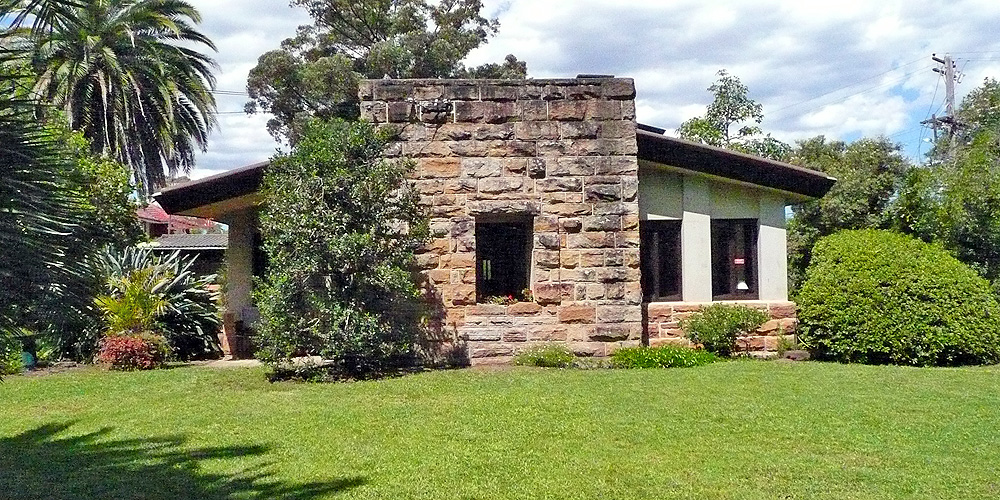
 With internal walls that gracefully curve into the ceiling rather than meet at a perpendicular, there is a sense of deep internal space here; as though one is within the midst of a cave, protected from a harsh outside. This degree of distance between the inside and outside is enhanced by sandstone walls that appear half-a-metre deep when one looks from inside, out the windows.((This is an effect created by U shaped outward jutting recesses on either side of the windows, recesses generally utilised as either storage cupboards or wardrobes.))
 When we then look at this same wall from the opposite side inside the living room—where, outside, there was a central void (a window) flanked by stone, inside we see the reverse: a central stone mass (housing the fireplace), flanked by voids (windows). The power of the outside symmetry asserts itself in reverse inside; until, that is, truth kicks in.
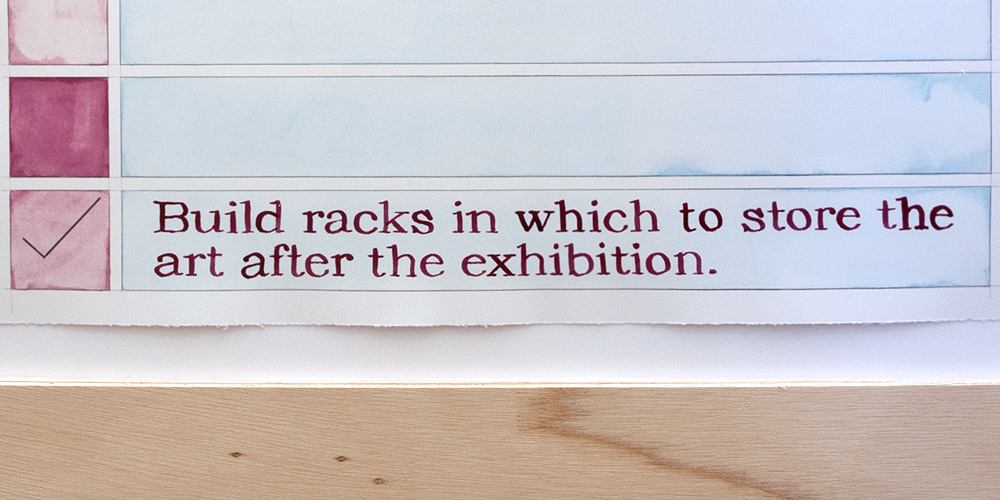
 Exhibition: To Do, in being a composition of space, is also a ‘To Do’ list compiled to complete an exhibition of art. The last of five items on the list reads: ‘Build racks in which to store the art after the exhibition’.
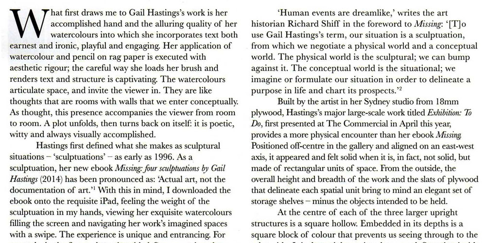
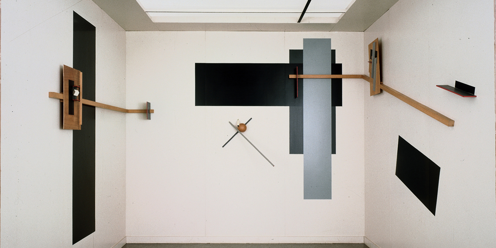

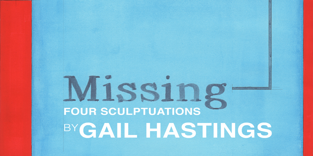
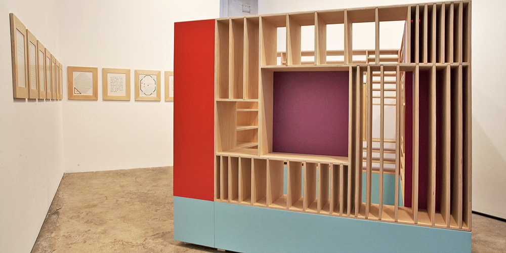
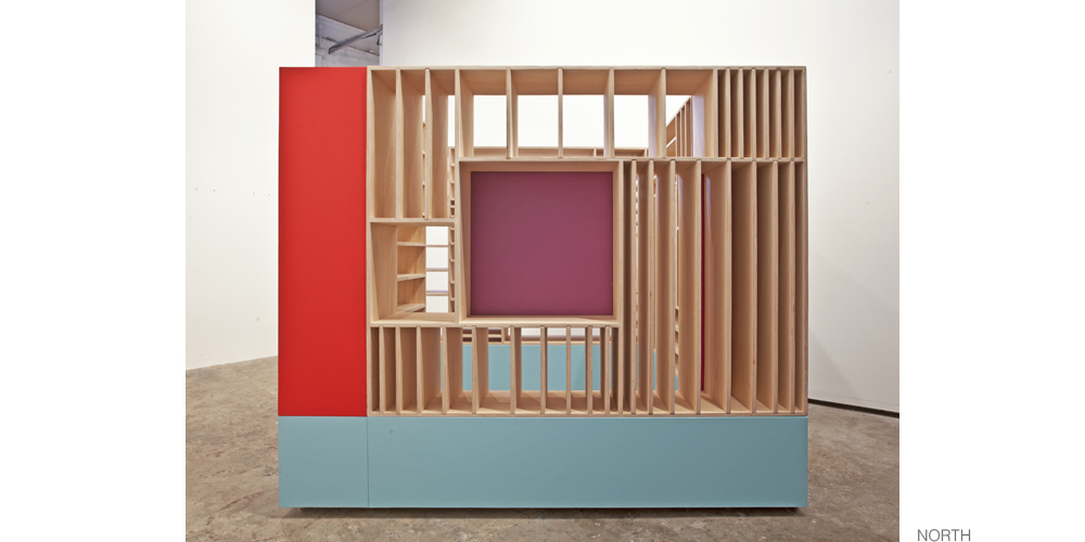
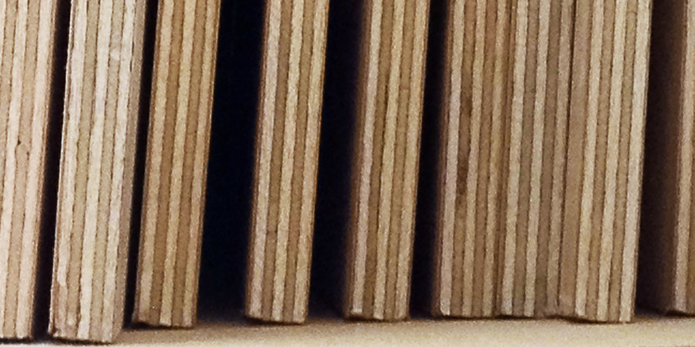
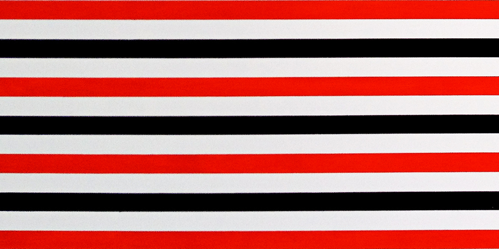
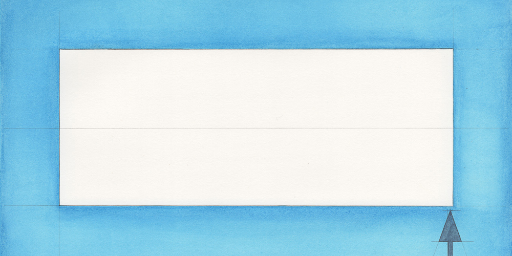
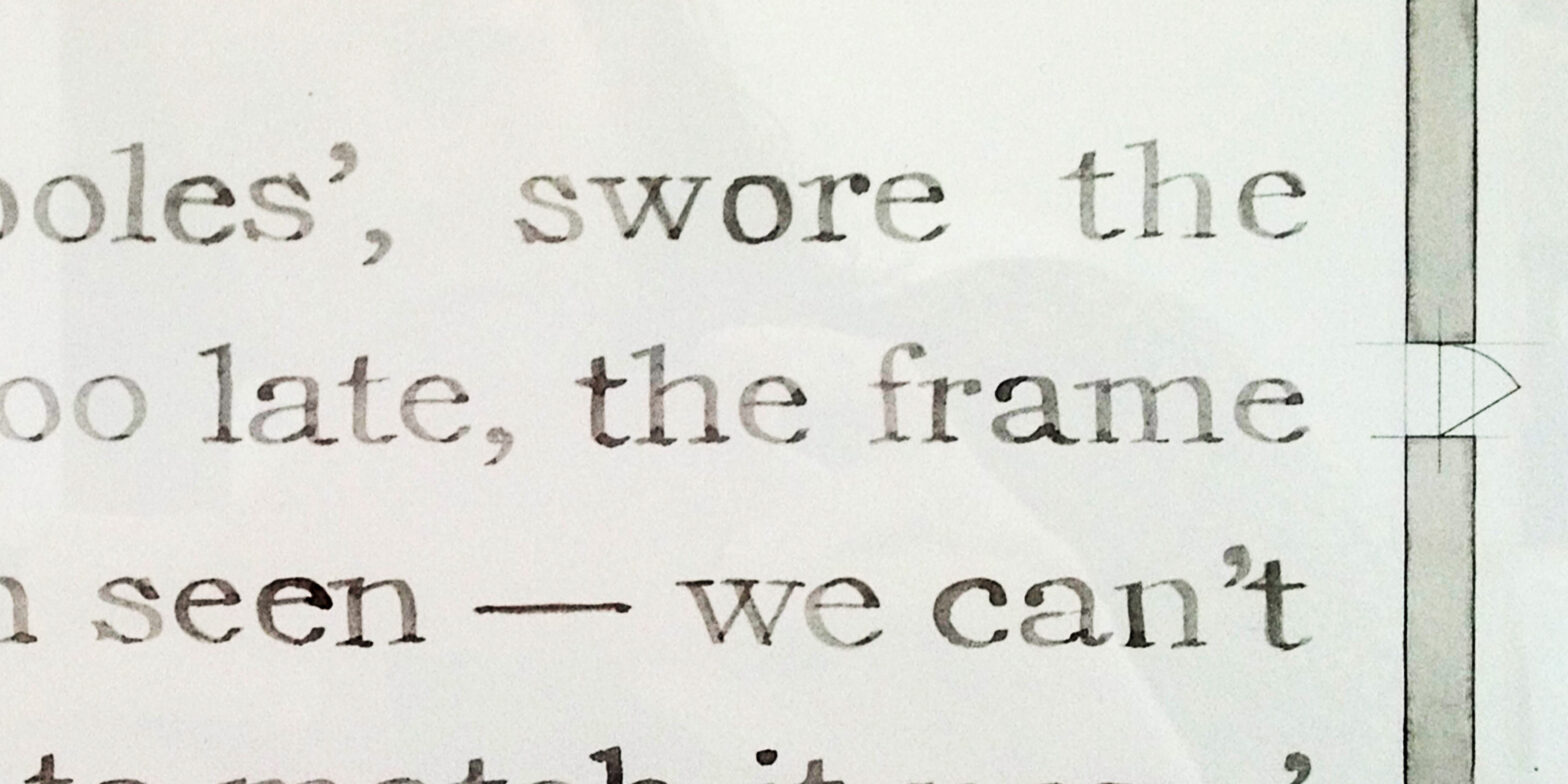
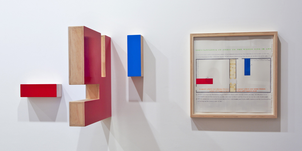
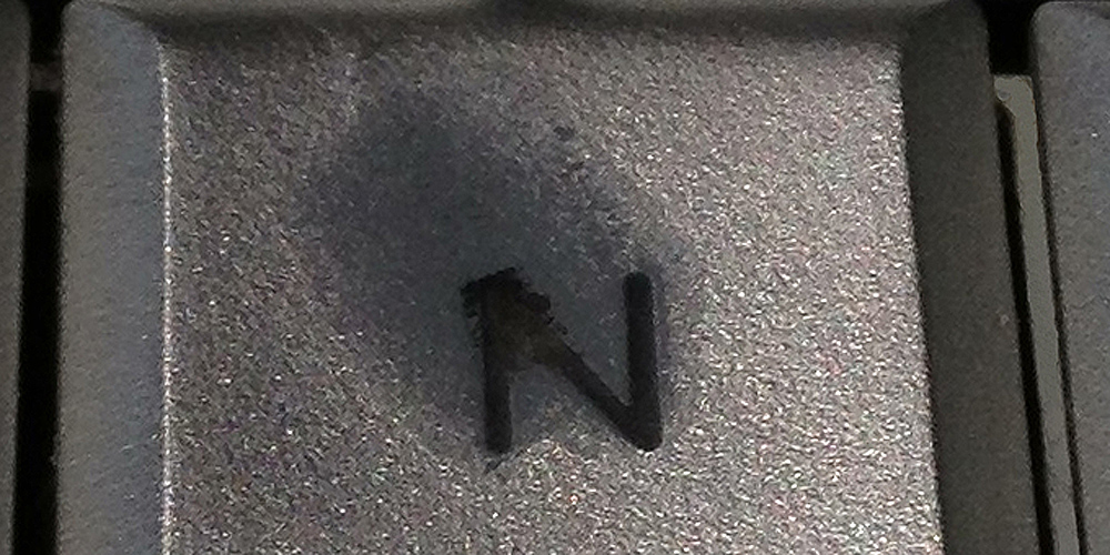
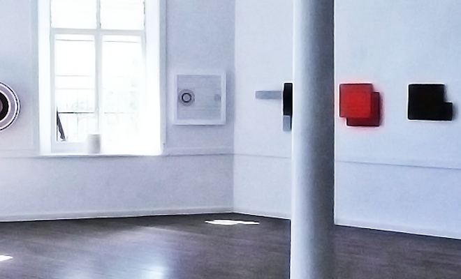
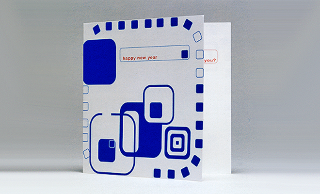
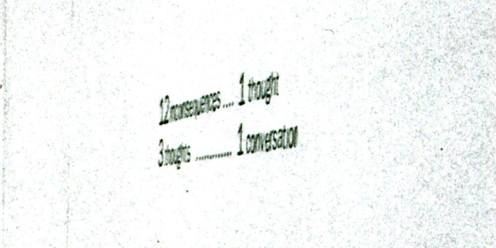
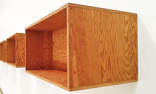


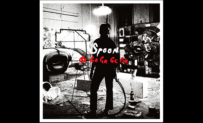
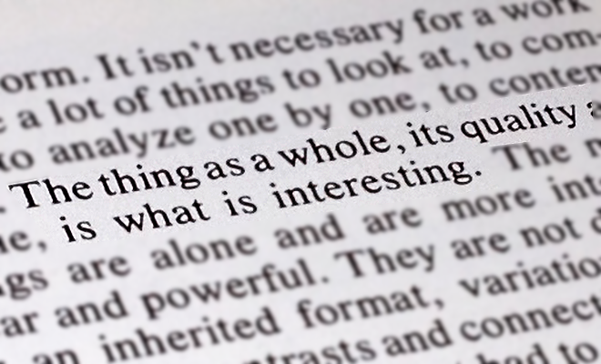

![Upcoming exhibition [space holder]](https://gailhastings.au/wp-content/uploads/2012/05/Donald-Judd-Untitled-1975-AGNSW.png)